Splunk Universal Forwarder Upgrades: From Manual Pain to Automated Gain
When was the last time you actually looked forward to upgrading your Splunk Universal Forwarders (UFs)? If you’re like most of the engineers we talk to, UFs are the last things to get touched. They’re usually stuck on the back burner because the sheer effort of touching hundreds—or thousands—of endpoints is incredibly tedious. While we focus our energy on keeping the core Splunk instances shiny and updated, the UF fleet often lingers several versions behind, creating a maintenance debt that only gets heavier over time. But what if we told you there’s finally a native way to solve this headache?
The “Back Burner” Dilemma: Why UFs Are So Hard
In the past, we’ve really only had three ways to handle these upgrades: manual, scripted, or through external automation platforms like Ansible or SCCM. If you’re a smaller shop, you’re likely doing manual installs, which means an engineer has to remotely access or physically touch every single box. Even if you’re a bit more mature and use scripts, it’s still a fragmented process.
The largest, most “mature” customers have already moved to heavy-duty automation platforms to manage their fleet, and they’ve built their own processes for this. But for everyone else—the folks relying on manual or basic scripted processes—Splunk didn’t have a native solution. Until now.
The Splunk Remote Upgrader
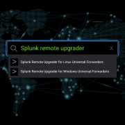
The Splunk Remote Upgrader is a free, Splunk-supported tool available as two separate apps on Splunkbase – one for Linux and one for Windows. It’s designed to run right alongside your existing UF on the endpoint.
Essentially, it acts as a separate application that monitors a predetermined directory (usually under temp) for new installation packages. As soon as it sees a new package land in that directory, it takes over the installation process for you.
What Can It Actually Upgrade?
- Target Versions: It can upgrade UFs to any version 9.0 or higher.
- Starting Point: You can use this process if your current forwarder is at version 8.0 or higher.
- Security First: It only supports signed UF packages. This is why the target must be 9+, as these versions include the necessary signature files for verification.
- OS Support: Currently, available for Linux and Windows platforms.
The Deployment Process
The biggest point of confusion we see is the relationship between the Upgrader and the Forwarder package. Think of them as two distinct pieces of the same puzzle.
1. Initial Setup
You still have to do the “first mile” yourself. You need to get the Remote Upgrader installed on the endpoint machine manually or through your existing external tools first. Once that Remote Upgrader daemon is running, it starts its “watch” on the /tmp/SPLUNK_UPDATER_MONITORED_DIR/ folder.
2. Preparing the Package
On your Deployment Server, you’ll prepare a package that contains the new UF version you want to deploy, along with its signature (.sig) file.
3. Execution and Monitoring
When you push this application via the Deployment Server, the UF pulls it down. The package contains a script that copies the new files over to the temp directory the Upgrader is monitoring.
Once the Upgrader detects those files, the real work begins:
- Three Strikes Rule: The Upgrader will try the installation up to three times if it fails.
- Timeout Safety: If an attempt gets stuck for more than five minutes, it gives up on that attempt.
- The Safety Net: If all attempts fail, it triggers an automatic rollback to your previous version. It even keeps a backup of your old configuration for 30 days by default, just in case.
Ready to finally tackle that fleet of 500 forwarders? It’s not just about the convenience; it’s about the peace of mind knowing you have a centralized, logged, and recoverable way to stay current.
Real-World Considerations and Constraints
While we’re big fans of this new tool, we have to stay grounded in reality. It’s not a “set it and forget it” magic wand for every scenario.
- Initial Effort: As we mentioned, the very first install of the Upgrader must be manual. However, once it’s there, the Upgrader can actually upgrade itself automatically in the future.
- Storage Requirements: You need at least 1GB of free space on the endpoint to handle the packages and the backups.
- Deployment Server Strategy: If you have a massive environment, you probably don’t want to hit 1,000 servers at once. You’ll need to be creative with your Server Classes to roll out the upgrades in waves.
- Windows Requirements: For those of you on Windows, make sure PowerShell scripting is enabled, as the process relies on it to function.
Conclusion
By adopting the Splunk Remote Upgrader, we’re moving away from the era of “neglected forwarders” and into a world of centralized, secure lifecycle management. It reduces maintenance overhead, ensures your fleet is consistent with the latest security patches, and lets you adopt new features faster than ever before. It might take a bit of initial legwork to get the Upgrader daemon onto your hosts, but the long-term payoff for your operations and security posture is massive.
Need help? If you need help architecting a massive UF rollout, contact us today – we’d love to help you streamline your data pipeline.
Discovered Intelligence Inc., 2026. Unauthorized use and/or duplication of this material without express and written permission from this site’s owner is strictly prohibited. Excerpts and links may be used, provided that full and clear credit is given to Discovered Intelligence, with appropriate and specific direction (i.e. a linked URL) to this original content.