This blog is a continuation of the blog “Using Density Function for Advanced Outlier Detection“. Given the unique but complementary topics of the previous blog and present one, we decided to separate them. This blog describes a single approach to dealing with excess noise in outliers detection use-cases. While multiple methods of reducing noise exist, this is one that has worked (at least in my experience) at multiple projects throughout the Splunk-verse to reduce outliers noise.
Multi-Tier Approach to Reducing Noise
Adding to the plethora of existing noise reductions techniques in the alert management space. We’ve use a multi-tiered approach to find outliers at an entity, system and organization level. Once implemented, we can correlate outliers at each stage to answer the one of the biggest questions in outlier detection – ‘Was this timeframe a true outlier?’. In this section we will discuss the theory of reducing outliers with some visual aide to explain our concept.
There are three tiers we can general look at for outliers when investigating and outlier use case. These tiers in my opinion can be classified into entity-level, system-level, aggregate level. In each of these tiers, we can utilize density function or any other methods such as LocalOutlier, Moving Averages and Quartile ranges to find timeframes that stood. Once the timeframes have been detected, we correlation with each tier to determine when did the outlier occur.
For clarity, the visual below shows what a 3-tier approach might look like. From the ground-up we start looking at outliers from an entity-level, at the second stage we look look at a group that can identify a collection of entities. These collection of entities could be AD Groups, business units, network zones and much more.
Hierarchy of Mutli-Tier Approach
Combining Outliers in a Multi-Tier Approach
After determining the the outlier method at each tier, our next step is to correlate and combe the outliers. Its important in the planning phase to find a common field across all tiers. I would recommend using “_time” in 15 or 30 minute buckets as the common field. Our outlier detection process will end up looking similar to the visual below, where each level has its unique search running and outputs a list of outliers based on ‘_time’ as the common field. The split_by fields can be different at each tier, this will allow us to find out which entity as part of a system or aggregate group was marked as an outlier at a certain time.
Multi-tier Outlier Process
After running the outlier detection searches, we can priortize outliers based off a tally or ranking system. Observe the tables on the right side in the picture above. Each timeframe is either a 1 or 0 if it was detected as outlier. ML algorithms automatically assign the is_outliers a value of ‘1’. For other methods we may have to manually give it the value of 1. Lets add up all the outlier count based on the timeframe.
Timeframe
outlier_count
11-02-2022 02:00:00
3 (high priority)
11-02-2022 17:40:00
2 (mid or low priority)
01-02-2022 13:30:00
0 (not outlier)
Total Count of Outliers
Adding the outlier count for each timeframe in each level will give us an idea on what we should emphasize on. Timeframes with the max 3 out of 3 outliers should take precedence in our investigations over timeframes that have 2 out of the possible 3 outlier count.
Conclusion
In the field, I’ve encountered many area’s where we have needed to adjust the thresholds and also find a way to reduce or analyze the outlier result. In doing so, a multi-tier approach has worked in some of the following specific scenarios:
Multi-tier data is available
Adjusting single outlier function (such as density function) captures too much or too little
Investigation into outlier leads to correlating if another feature/data source had outliers at a specific time
This can be complex to set-up, however one set-up its a repetitive process that can be applied to many use-cases that use outlier or anomaly detection.
https://discoveredintelligence.com/wp-content/uploads/2013/12/DI-Logo1-300x137.png00Discovered Intelligencehttps://discoveredintelligence.com/wp-content/uploads/2013/12/DI-Logo1-300x137.pngDiscovered Intelligence2022-03-11 20:29:132024-07-28 15:24:56Reducing Outlier Noise in Splunk
In our previous blog we covered some common methods of finding an outliers. Starting with fixed thresholds to moving thresholds using averages and standard deviation. This forms the basis of data points that deviate from their norm. Using standard methods of outlier detection does have it pro’s and con’s. On one hand they are very easy to implement and derive reason for outlier detection. On the other hand, they are too simple
Key Concepts In this Blog
The terminology we will use will not differ significantly from our previous blog except with the introduction of the following terms:
Density Function Command: The density function command is housed within the MLTK application. Most mathematicians think about Z-score or normal distribution when a density function is mentioned. However within Splunk’s MLTK command there are 4 distributions that attempt to map the distribution of the data. They are ‘Normal (Z-score), Exponential, Gaussian Kernel Density and Beta Distribution’. The command will attempt to find the best distribution fit for the data given the split-by field.
More can be read about this command the Splunk blog post here.
Ensemble Methods: Ensemble methods is a technique within the Machine Learning space to combine multiple algorithms to create an optimal model. My favourite blog channel ‘towards data science’ explains it here.
Using MLTK Algorithms for Outlier Detection
Splunk’s Machine Learning Toolkit hosts 3 algorithms for anomaly detection. Whilst they each provide value, some may better suited in specific scenarios. Most if not all of the anomaly detection algorithms can be used on numerical and categorical fields. To illustrate their feature we picked the Density Function to enumerate and deep-dive into here.
DensityFunction
The density function is a popular and relatively simple method of finding outliers assuming no changes to default parameters. Underneath the hood though, it contains many configuration opens for users to fine tune their outlier detection. Lets cover some of the parameters I’ve come across tuning in the field:
parameter
default_value
description
when to adjust parameter
sample
false
When set to true, it takes sample from the ‘inliear’ region of the distribution.
When you have a large volume of data points + and need to remove initial outliers from your model. This is beneficial when you have more than a million events as the density function has a soft limit on events.
full_sample
false
When set to ‘true’ it takes sample from the ‘inliear’ and ‘outlier’ region of the distribution.
When you have a large volume of data points and would like to consider outliers samples in your outlier detection model. This is beneficial when you have more than a million events as the density function has a soft limit on events.
dest
auto
When set to ‘true’ the density of each data point will show.
Our suggestion is keep this as ‘auto’ . It allow MLTK to determine the best algorithm based on the values of each group. Set this as a specific distribution when the distribution is expected to a singular.
random_state
N/A
Identify which distribution you should like to run.
Use this parameter when developing your model on a fixed data set. Using the same random_state with all other configurations unchanged will return the same result. This is helpful to use when two or more users are working off the same data.
partial_fit
false
Incrementally ‘train’ and update the model based on new data. This is useful when you have a large volume of data and are unable to train.
Scenarios where using partial fit is helpful is to train your function over time where running a single fit command will reach an MLTK limit; such as over 7 days, 1 month and so on.
threshold
0.01
1 less than the threshold value shows the area under the curve.
This parameter can be adjusted to ease or restrict the criteria for detecting outliers. The smaller the value the less number of outliers (more restrictive) will be. On
List of commonly used parameters from Density Function
Adding onto a list of useful parameters, there is a ‘by’ clause within the Density Function. It gives the user the ability to group data based on a categorial field (grouping field). This grouping field can be location, intranet zone, host type, asset type, user type and much more. Lets start building some searches to utilize the density function:
Base Query
The base query to understand the Density Function a bit better is shown below. We are using the out-of-the-box lookup to run our query. The file ‘call_center.csv’ contains a list of call records count over a 2 month period starting in September 2017 till November. Next we are running 2 eval functions to extract the HourOfDay and DayOfWeek from the data.
Univariate in this context means that we will analyze outliers based on a single field of interest. For this section we picked ‘DayOfWeek’ as the field. We appended any new queries to our base query. This search will run the density function on the total count of activity based on the DayOfTheWeek. It will give us list of outliers, boundary range the outlier fill in and the probability density of the outlier. The two columns to focus on are “IsOutlier(count)” and “ProbabilityDensity(count)”. The lower the probability density, the higher the chance the value of count on the DayOfTheWeek has to be an outlier.
... | fit DensityFunction count by DayOfWeek into densityfunction_testmodel
Once we run the fit command, we can see 3 new columns created named “isOutlier(count), BoundaryRanges, ProbabilityDensity(count)”.
Using the density function is quite simple as using the fit command provided by MLTK. In order to use the DensityFunction algorithm effectively I will recommend to test and verify outliers with different parameters configurations. One such parameter that you can modify is the ‘threshold’ function. To test its impact on the result, I created a table below to analyze the outlier count based on different values.
Threshold
Outlier Count ‘(| stats count(eval(is_outlier=1)) as outlier_count’
0.01 (default)
116
0.05
590
0.09
1027
0.005
59
0.001
11
Table displaying outlier count on varied thresholds
After creating the table, it becomes clear as the thresholds value decreases, the DensityFunction is more restrictive in finding outliers. As we increase the threshold value outliers number increase as it becomes less restrictive.
Visualizing Changing Parameters with DensityFunction
To visual the impact of the different threshold levels we add the ‘show_option’ parameters to the density function as shown below:
... | fit DensityFunction count by DayOfWeek into densityfunction_testmodel threshold=0.005 show_density=true show_options="feature_variables, split_by, params"
After that, we use the MLTK ‘distribution plot’ visual to look at the distribution plot of the data.
Distribution Plot of All Days of Week
From the above plot, each line represents each day of the week, Monday thru Sunday. However, to view this with clarity lets filter this visual to a single day only in the picture below.
... | fit DensityFunction count by DayOfWeek into densityfunction_testmodel threshold=0.005 show_density=true show_options="feature_variables, split_by, params"
| search DayOfWeek="Monday"
Distribution Plot of Monday Only
In the above distribution plot, we can see that on Monday, the call volumes of around 900, 1100 1250 and 1300 were detected as outliers. It might appear that the outliers exist on the right side of the graph because they are extremely high values compared to the rest of the calls volumes. However, they are detected as outliers due to the low probability of these high values occurring.
Looking at the same Distribution Plot of Monday, the range of values between 300-500 have a low count as well. As we increase the thresholds we to 0.05. Notice how more values with low counts will be selected. This is due to the lower probability of them occurring in the dataset of and us relaxing the threshold. This concept ties back directly to the table we built in the ‘Using The Density Function - Univariate Outlier‘ section.
... | fit DensityFunction count by DayOfWeek into densityfunction_testmodel threshold=0.05 show_density=true show_options="feature_variables, split_by, params"
| search DayOfWeek="Monday"
Distribution Plot of Monday with Threshold=0.05
Conclusion
The DensityFunction is great and easy to use algorithm available along with MLTK for finding outliers. It’s very well documented in the Splunk Documentations and used commonly in the community. Some of the scenarios I’ve found it to be helpful in are listed below:
Quick and easy scenario’s use of ML to find outliers
Use cases where anomalies in aggregate counts are used to find outliers
Finding unexpected counts over times and hours when activity counts are not expected
However, one drawback and feature to using the DensityFunction is that it does not have historic or outside context. It will find outliers based on counts and its deviations. This can result in a same entities selected as outliers in multiple iterations over multiples times. One of the ways to tackle this is via adding context and using scores in Splunk. We talk about this method in our blog https://discoveredintelligence.ca/reducing-outlier-noise-in-splunk/.
https://discoveredintelligence.com/wp-content/uploads/2013/12/DI-Logo1-300x137.png00Discovered Intelligencehttps://discoveredintelligence.com/wp-content/uploads/2013/12/DI-Logo1-300x137.pngDiscovered Intelligence2022-02-14 15:44:062024-07-28 15:19:17Using DensityFunction for Outlier Detection in Splunk
The Splunk Machine Learning Toolkit is packed with machine learning algorithms, new visualizations, web assistant and much more. This blog sheds light on some features and commands in Splunk Machine Learning Toolkit (MLTK) or Core Splunk Enterprise that are lesser known and will assist you in various steps of your model creation or development. With each new release of the Splunk or Splunk MLTK a catalog of new commands are available. I attempt to highlight commands that have helped in some data science or analytical use-cases in this blog.
https://discoveredintelligence.com/wp-content/uploads/2020/10/image-10.png2561892Discovered Intelligencehttps://discoveredintelligence.com/wp-content/uploads/2013/12/DI-Logo1-300x137.pngDiscovered Intelligence2020-11-12 20:24:382022-10-31 14:41:21Interesting Splunk MLTK Features for Machine Learning (ML) Development
There are multiple (almost discretely infinite) methods of outlier detection. In this blog I will highlight a few common and simple methods that do not require Splunk MLTK (Machine Learning Toolkit) and discuss visuals (that require the MLTK) that will complement presentation of outliers in any scenario. This blog will cover the widely accepted method of using averages and standard deviation for outlier detection. The visual aspect of detecting outliers using averages and standard deviation as a basis will be elevated by comparing the timeline visual against the custom Outliers Chart and a custom Splunk’s Punchcard Visual.
Some Key Concepts
Understanding some key concepts are essentials to any Outlier Detection framework. Before we jump into Splunk SPL (Search Processing Language) there are basic ‘Need-to-know’ Math terminologies and definitions we need to highlight:
Outlier Detection Definition: Outlier detection is a method of finding events or data that are different from the norm.
Average: Central value in set of data.
Standard Deviation: Measure of spread of data. The higher the Standard Deviation the larger the difference between data points. We will use the concept of standard substantially in today’s blog. To view the manual method of standard deviation calculation click here.
Time Series: Data ingested in regular intervals of time. Data ingested in Splunk with a timestamp and by using the correct ‘props.conf’ can be considered “Time Series” data
Additionally, we will leverage aggregate and statistic Splunk commands in this blog. The 4 important commands to remember are:
Bin: The ‘bin’ command puts numeric values (including time) into buckets. Subsequently the ‘timechart’ and ‘chart’ function use the bin command under the hood
Eventstats: Generates statistics (such as avg,max etc) and adds them in a new field. It is great for generating statistics on ‘ALL’ events
Streamstats: Similar to ‘stats’ , streamstats calculates statistics at the time the event is seen (as the name implies). This feature is undoubtedly useful to calculate ‘Moving Average’ in additional to ordering events
Stats: Calculates Aggregate Statistics such as count, distinct count, sum, avg over all the data points in a particular field(s)
Data Requirements
The data used in this blog is Splunk’s open sourced “Bots 2.0” dataset from 2017. To gain access to this data please click here. Downloading this data set is not important, any sample time series data that we would like to measure for outliers is valid for the purposes of this blog. For instance, we could measure outliers in megabytes going out of a network OR # of logins in a applications using the using the same type of Splunk query. The logic used to the determine outliers is highly reusable.
Using SPL
There are four methods commonly seen methods applied in the industry for basic outlier detection. They are in the sections below:
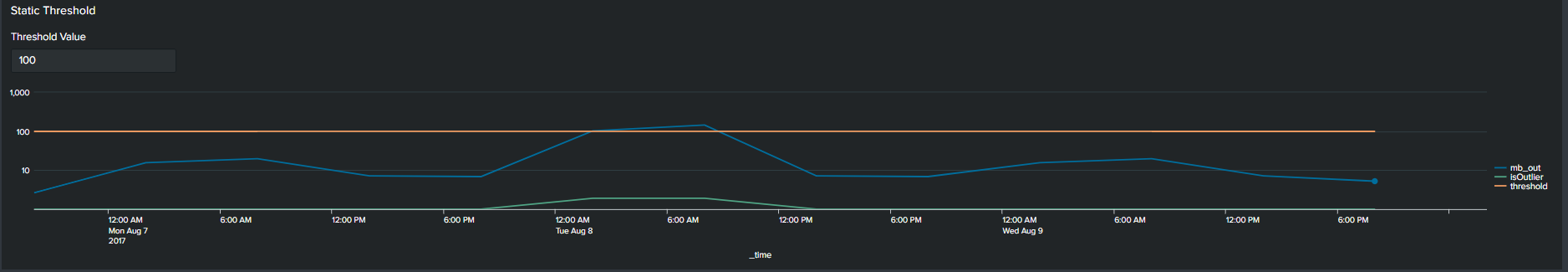
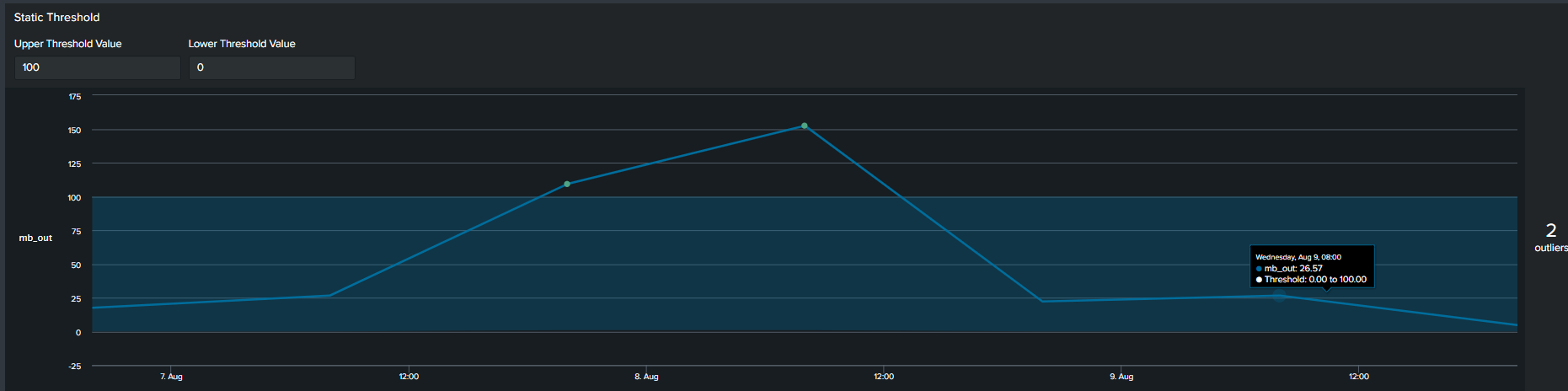
1. Using Static Values
The first commonly used method of determining an outlier is by constructing a flat threshold line. This is achieved by creating a static value and then using logic to determine if the value is above or below the threshold. The Splunk query to create this threshold is below :
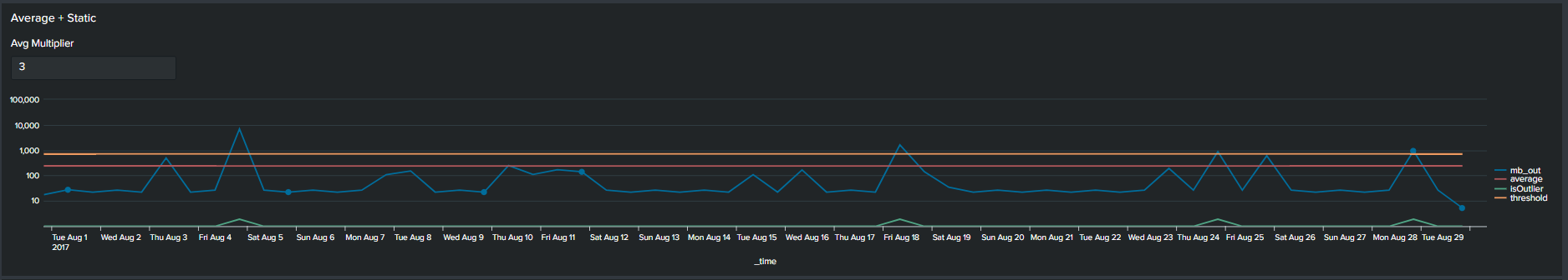
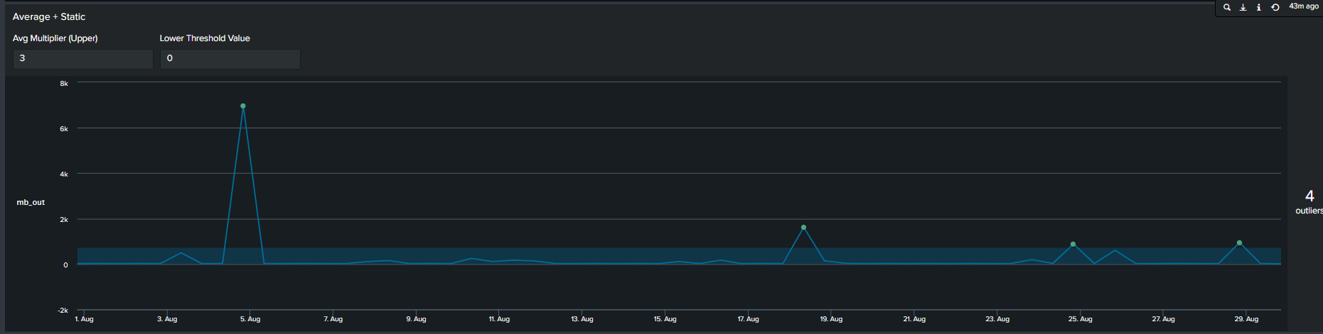
In addition to using arbitrary static value another method commonly used method of determining outliers, is a multiplier of the average. We calculate this by first calculating the average of your data, following by selecting a multiplier. This creates an upper boundary for your data. The Splunk query to create this threshold is below:
<your spl base search> …
| timechart span=12h sum(mb_out) as mb_out
| eventstats avg("mb_out") as average
| eval threshold=average*2
| eval isOutlier=if('mb_out' > threshold, 1, 0)
Average + Static threshold timeline visual
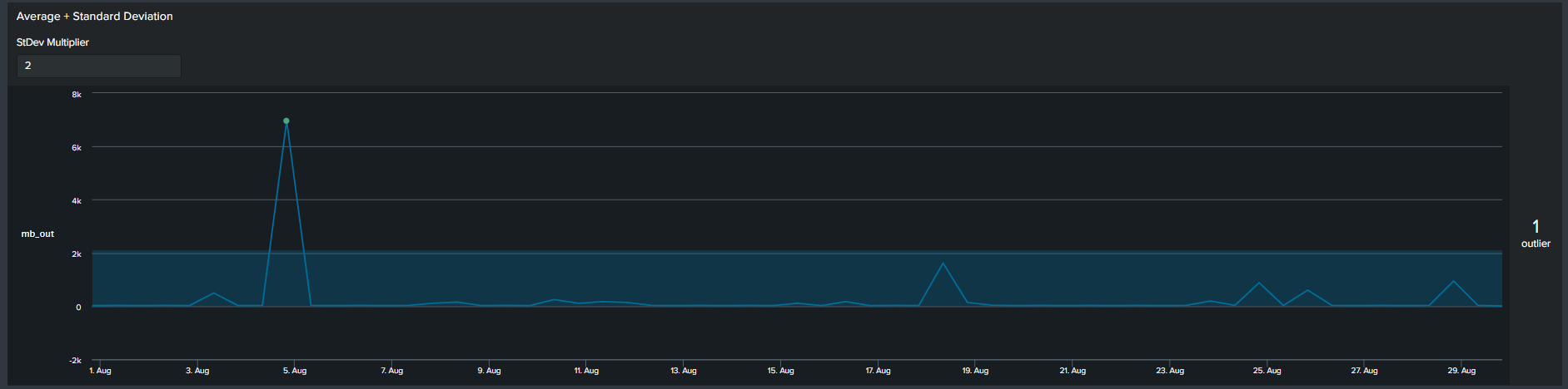
3. Average with Standard Deviation
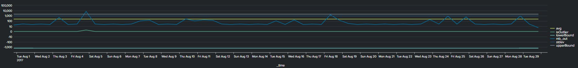
Similar to the previous methods, now we use a multiplier of standard deviation to calculate outliers. This will result in a fixed upper and lower boundary for the duration of the timespan selected. The Splunk query to create this threshold is below:
<your spl base search> ... | timechart span=12h sum(mb_out) as mb_out
 | eventstats avg("mb_out") as avg stdev("mb_out") as stdev
 | eval lowerBound=(avg-stdev*exact(2)), upperBound=(avg+stdev*exact(2))
 | eval isOutlier=if('mb_out' < lowerBound OR 'mb_out' > upperBound, 1, 0)
2*Standard Deviation timeline visual
Notice that with the addition of the lower and upper boundary lines the timeline chart becomes cluttered.
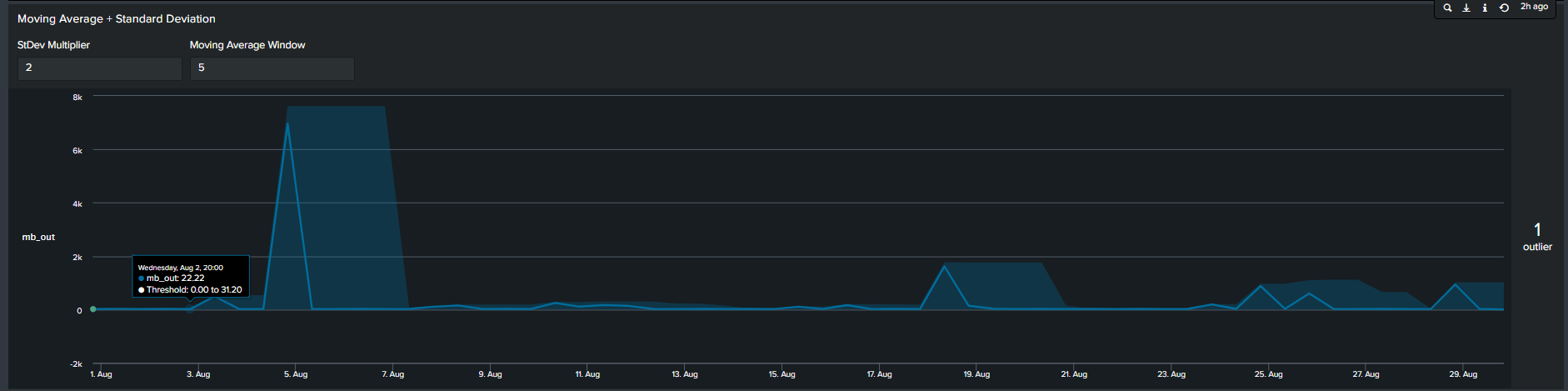
4. Moving Averages with Standard Deviation
In contrast to the previous methods, the 4th most common method seen is by calculating moving average. In short, we calculate the average of data points in groups and move in increments to calculate an average for the next group. Therefore, the resulting boundaries will be dynamic. The Splunk search to calculate this is below:
<your spl base search> ... | timechart span=12h sum(mb_out) as mb_out
 | streamstats window=5 current=true avg("mb_out") as avg stdev("mb_out") as stdev
 | eval lowerBound=(avg-stdevexact(2)), upperBound=(avg+stdevexact(2))
 | eval isOutlier=if('mb_out' < lowerBound OR 'mb_out' > upperBound, 1, 0)
Moving Average with Standard Deviation timeline chart
Tips: Notice the “isOutliers” line in the timeline chart, in order to make smaller values more visible format the visual by changing the scale from linear to log format.
Using the MLTK Outlier Visualization
Splunk’s Machine Learning Toolkit (MLTK) contains many custom visualization that we can use to represent data in a meaningful way. Information on all MLTK visuals detailed in Splunk Docs. We will look specifically at the ‘Outliers Chart’. At the minimum the outlier chart requires 3 additional fields on top of your ‘_time’ & ‘field_value’. First, would need to create a binary field ‘isOutlier’ which carries the value of 1 or 0, indicating if the data point is an outlier or not. The second and third field are ‘lowerBound’ & ‘upperBound’ indicating the upper and lower thresholds of your data. Because the outliers chart trims down your data by displaying only the value of data point and your thresholds, we can conclude through use that it is clearer and easier to understand manner. As a recommendation it should be incorporated in your outliers detection analytics and visuals when available.
Continuing from the previous paragraph, take a look at the below snippets at how the impact the outliers chart is in comparison to the timeline chart. We re-created the same SPL but instead of applying timeline visual applied the ‘Outliers Chart’ in the same order:
Static threshold w outliers chartAverage + Static threshold timeline visual 2*Standard Deviation outliers chart Moving Average with Standard Deviation outliers chart
Advantages
Disadvantages
Cleaner presentation and less clutter
You need to install Splunk MLTK (and its pre-requisites) to take advantage of the outliers chart
Easier to understand as determining the boundaries becomes intuitive vs figuring out which line is the upper or lower threshold
Unable to append additional fields in the Outliers chart
Adding Depth to your Outlier Detection
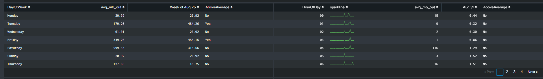
Determining the best technique of outlier detection can become a cumbersome task. Hence, having the right tools and knowledge will free up time for a Splunk Engineer to focus on other activities. Creating static thresholds over time for the past 24hrs, 7 days, 30 days may not be the best approach to finding outliers. A different way to measure outliers could be by looking at the trend on every Monday for the past month or 12 noon everyday for the past 30 days. We accomplish this by using two simple and useful eval functions:
Continuing from the previous section, we incorporate the two highlighted eval functions in our SPL to calculate the average ‘mb_out’. However, this time the average is based on the day of the week and the hour of the day. There are a handful of advantages of this method:
Extra depth of analysis by adding 2 additional fields you can split the data by
Intuitive method of understanding trends
Some use cases of using the eval functions are as follows:
Network activity analysis
User behaviour analysis
Tables representing averages by DayOfWeek & HourOfDay
Visualizing the Data!
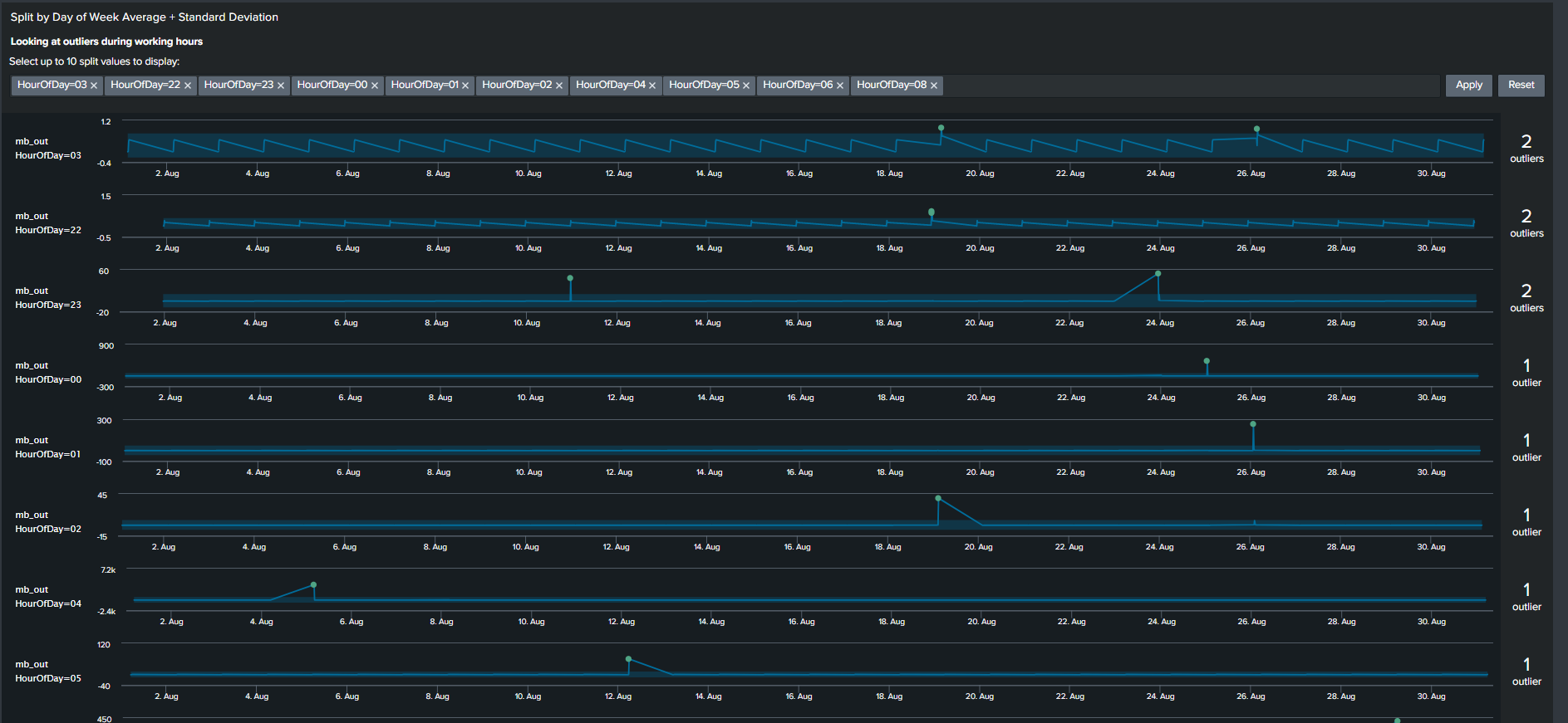
We will focus on two visualizations to complement our analysis when utilizing the eval functions. The first visual, discussed before, is the ‘Outliers Chart’ which is a custom visualization in Splunk MLTK. The second visual is another custom visualization ‘PunchCard’, it can be downloaded from Splunkbase here (https://splunkbase.splunk.com/app/3129/).
The outliers chart has a feature which results in a ‘swim lane’ view of a selected field/dimension and your data points while highlighting points that are outliers. To take advantage of this feature, we will use a Macro “splitby” which creates a hidden field(s) “_<Field(s) you want data to split by>”. The rest of the SPL is shown below
This search results in an Outlier Chart that looks like this:
Outliers Chart split by hour of day
The Outliers Chart has the capability to split by multiple fields, however in our example splitting it by a single dimension “HourOfDay” is sufficient to show its usefulness.
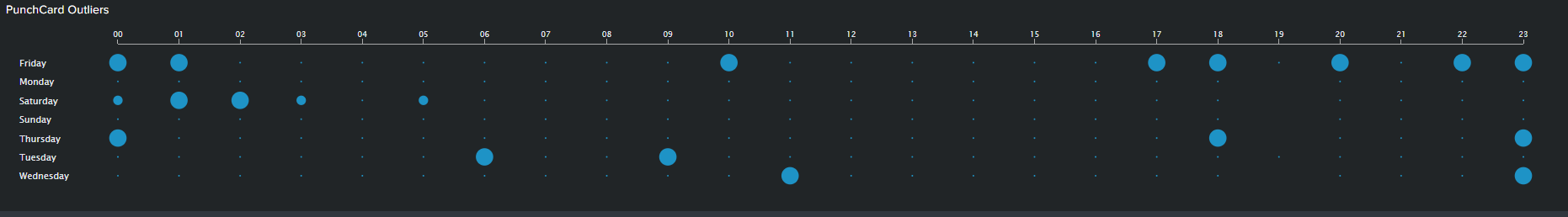
The PunchCard visual is the second feature we will use to visualize outliers. It displays cyclical trends in our data by representing aggregated values of your data points over two dimensions or fields. In our example, I’ve calculated the sum of outliers over a month based on “DayOfWeek” as my first dimension and “HourOfDay” as my second dimension. I’ve adding the outliers of these two fields and displaying it using the PunchCart visual. The SPL and image for this visual is show below:
< your base SPL search > ... | streamstats window=10 current=true avg("mb_out") as avg stdev("mb_out") as stdev by "DayOfWeek" "HourOfDay"
| eval avg=round(avg,2)
| eval stdev=round(stdev,4)
| eval lowerBound=(avg-stdevexact(2)), upperBound=(avg+stdevexact(2))
| eval isOutlier=if('mb_out' < lowerBound OR 'mb_out' > upperBound, 1, 0)
| splitby("DayOfWeek","HourOfDay")
| stats sum(isOutlier) as mb_out by DayOfWeek HourOfDay
| table HourOfDay DayOfWeek mb_out
PunchCard Visual
Summary and Wrap Up
Trying to find outliers using Machine Learning techniques can be a daunting task. However I hope that this blog gives an introduction on how you can accomplish that without using advanced algorithms. Consequently, using basic SPL and built-in statistic functions can result in visuals and analysis that is easier for stakeholders to understand and for the analyst to explain. So summarizing what we have learnt so far:
One solution does not fit all. There are multiple methods of visualizing your analysis and exploring your result through different visual features should be encouraged
Use Eval functions to calculate “DayOfWeek” and “HourOfDay” wherever and whenever possible. Adding these two functions provides a simple yet powerful tool for the analyst to explore the data with additional depth
Trim or minimize the noise in your Outliers visual by using the Outliers Chart. The chart is beneficial in displaying only your boundaries and outliers in your data while shaving all other unnecessary lines
Use “log” scale over “linear” scale when displaying data with extremely large ranges
Part II of the Forecasting Time Series blog provides a step by step guide for fitting an ARIMA model using Splunk’s Machine Learning Toolkit. ARIMA models can be used in a variety of business use cases. Here are a few examples of where we can use them:
Detecting anomalies and their impact on the data
Predicting seasonal patterns in sales/revenue
Streamline short-term forecasting by determine confidence intervals
From Part 1 of the blog series, we identified how you can use Kalman Filter for forecasting. The observation we made from the resulting graphs demonstrated how it was also useful in reducing/filtering noise (which is how it gets its name ‘Filter’) . On the other hand ARIMA belongs to a different class of models. In comparison to a Kalman filter, ARIMA models works on data that has moving averages over time or where the value of a data point is linearly depending on its previous value(s). In these two scenarios it makes more sense to use ARIMA over Kalman Filter. However good judgement, understanding of the data-set and objective of forecasting should always be the primary method of determining the algorithm.
Objective
Part II of this blog series aims to familiarize a Splunk user using the MLTK Assistant for forecasting their time series data, particularly with the ARIMA option. This blog is intended as a guide in determining the parameters and steps to utilize ARIMA for your data. In fact, it is a generalized template that can be used with any processed data to forecasting with ARIMA in Splunk’s MLTK. An advantage of using Splunk for forecasting is its benefit in observing the raw data side by side with the predicted data and once the analysis is complete, a user can create alerts or other actions based on a future prediction. We will talk more about creating alerts based on predicted or forecasted data in a future blog (see what I predicted there ;)?)
If you have read part I of our blog, we will reuse the same dataset
process_time.csv
for this part. If not, click here to navigate to part I to understand the dataset.
Fundamental Concept for ARIMA Forecasting
A fundamental concept to understand before we move ahead with ARIMA is that the model works best with stationary data. Stationary data has a constant trend that does not change overtime. The average value is also independent of time as another characteristic of stationary data.
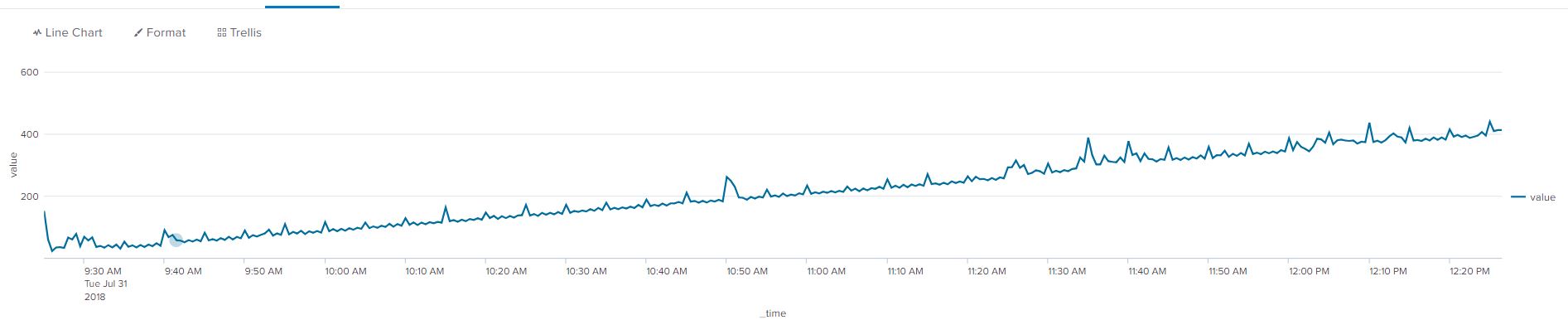
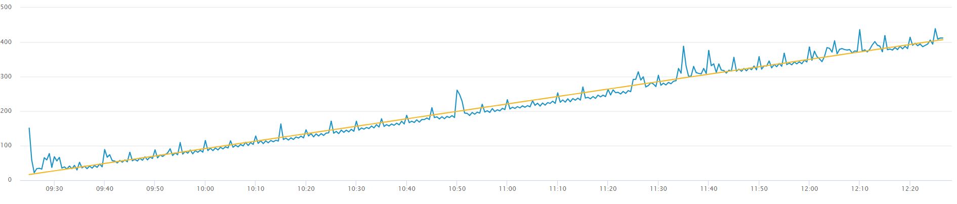
A simple example of non-stationary data is are the two graphs below, the first without a trendline, the second with a yellow trendline to show an average increase in the value of our data points. The data needs to be transformed into stationary data to remove the increasing trend.
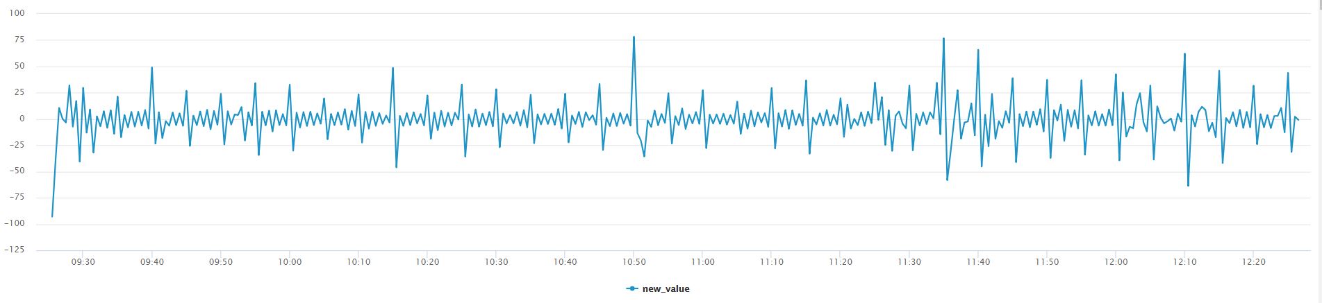
Using Splunk’s autoregress command we can apply differencing to our data. The results are immediately visible through line chart visual! The below command can be used on any time series data set to demonstrate differencing.
Without creating a trendline for the below graph we can see that the data fluctuates around a constant mean value of ‘0’, we can say that differencing is applied. Differencing to make the data stationary can increase the accuracy and fit of our ARIMA forecast. To read more about differencing and other rules that apply on ARIMA, navigate to the Duke URL provided in the useful link section:
Differencing is simply subtracting the current and previous data points. In our example we are only applying differencing by an order of 1, meaning we will subtract the present data point by one data point in reverse chronological order. There are different types of non-stationary graphs, which require in-depth domain knowledge of ARIMA, however we simplify it in this blog and use differencing to remove the non-constant trend in this example 😊!
From part 1 of this blog series we can see that our data does not have a constant trend, as a result we apply differencing to our dataset. The step to apply differencing from the MLTK Assistant is detailed in the ‘Determining Starting Points’ section. Differencing in ARIMA allows the user to see spikes or drops (outliers) in a different perspective in comparison to Kalman Filter.
Walkthrough of MLTK Assistant for ARIMA
ARIMA is a popular and robust method of forecasting long-term data. From blog 1 we can describe Kalman Filter’s forecasting capabilities as extending the existing pattern/spikes, sort of a copy-paste method which may be advantageous when forecasting short-term data. ARIMA has an advantage in predicting data points when the we are uncertain about the future trend of the data points in the long-term. Now that we have got you excited about ARIMA, lets see how we can use it in Splunk’s MLTK!
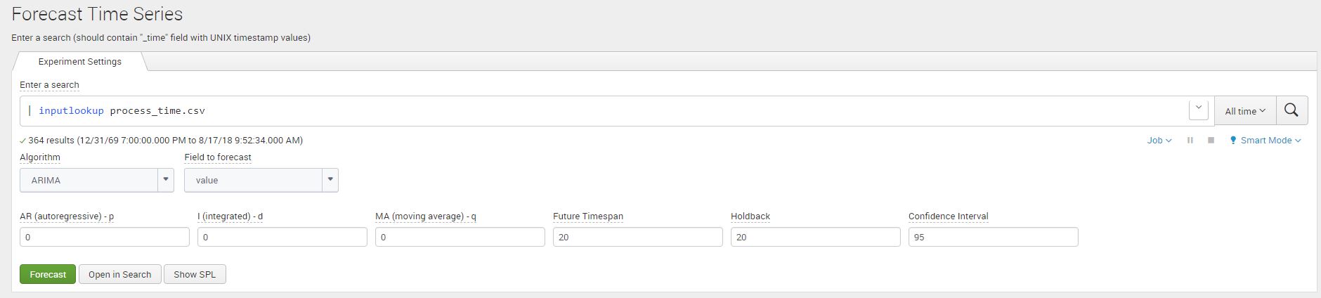
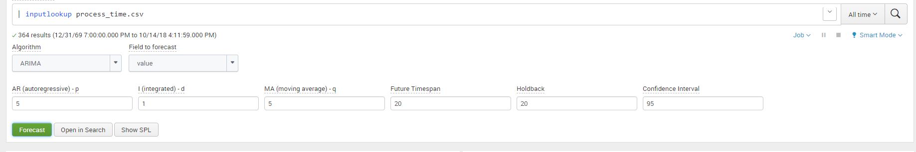
We use the Machine Learning Toolkit Assistant for forecasting timeseries data in Splunk. Navigate to the Forecast Time Series Assistant page (Under the Classic Menu option) and use the Splunk ‘inputlookup’ command to view the process_time.csv file.
|inputlookup process_time.csv
Once we add the dataset click on Algorithm and select ‘ARIMA’ (Autoregressive Integrated Moving Average), and ‘value’ as your field to forecast. You will notice that the ARIMA arguments will appear.
There are three arguments that make up the ARIMA model:
Argument
Definition
AutoRegressive – p
Auto regressive (AR) component refers to the use of past values in the regression equation. Higher the value the more past terms you will use in the equation. This concept is also called ‘lags’. Another way of describing this concept is if the value your data point is depending on its previous value e.g process time right now will depend on the process time 30 seconds before (from our data set)
Integrated – d
The d represents the degrees of differencing as discussed in the previous section. This makes up the integrated component of the ARIMA model and is needed for the stationary assumption of the data.
Moving Average – q
Moving Average in ARIMA refers to the use of past errors in the equation. It is the use of lagging (like AR) but for the error terms.
Determine Starting Points
Identify the Order of Differencing (d)
As a refresher, we utilized the same dataset we worked with in part 1 of the blog series regarding the Kalman filter. As I input my process_time.csv file in the assistant, I enter the future_timespan variable as 20 and the holdback as 20. I’ve kept the confidence interval as default value ‘95’. Once the argument values are populated click on ‘Forecast’ to see the resulting graphs.
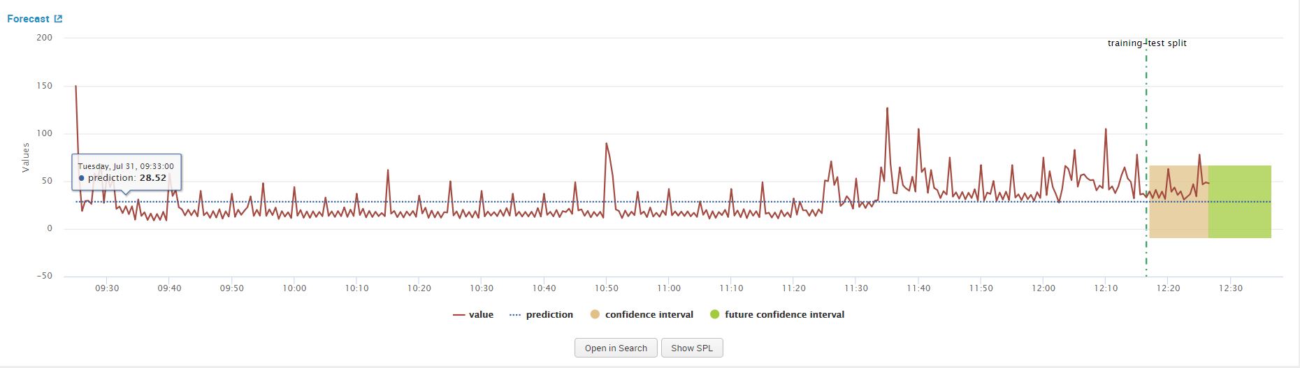
As a note, my ARIMA arguments described above are ARIMA(0,0,0) which can represented as a mathematics function ARIMA(p,d,q), where p,d,q = 0. We use this functional representation of the variables frequently in this blog for consistently with generally used mathematical languages.
When we click on forecast, observe the line chart graph from the results that show. This above graph confirms that the data is non-stationary, we will apply differencing to make it stationary. We can accomplish this by increasing the value of our ‘d’ argument from ‘0’ to ‘1’ in the forecasting assistant and clicking on forecast again. This step is essential to meet one of the main criteria’s of using ARIMA discussed in the ‘Fundamental Concept for ARIMA’ section.
Identifying AR(p) and MA(q)
After we apply differencing to our data our next step is to determine the AR or MR terms that mitigate any auto correlation in our data. There are two popular methods of estimating the these two parameters. We will expand on one of the methods in this blog.
Method 1
The first method for estimating the value of ‘p’ and ‘q’ is to use the Akaiki Information Criteria (AIC) and the Baysian Information Criteria (BIC), however using them is outside the scope of the blog as we will use a different method from the MLTK given the tools we have at hand. For the curious mind, the following blog contains detailed information on AIC and BIC to determine our ‘p’ and ‘q’ values:
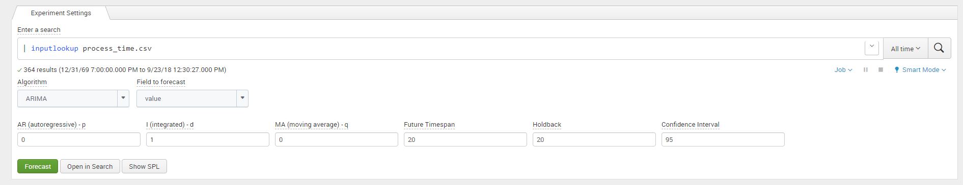
After we have applied differencing to our time series data, we review the PCAF and the ACF plots to determine an order for AR(q) or MA(q). We will apply ARIMA(0,1,0) in our ARIMA MLTK assistant and then click on ‘Forecast’ to view the results of the graph. The below image shows the values that we entered in the assistant:
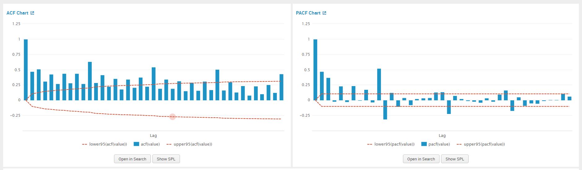
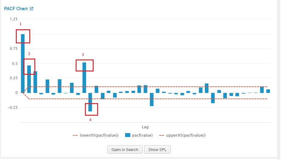
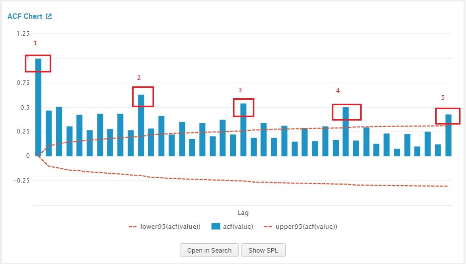
Once we click on forecast, we view the PACF plot to estimate a value for AR(p) model. Similarly we use the ACF plot to estimate a value for MA(q). The graphs are shown in the screenshot below.
We examine the PACF plot for a suggestion for our AR value, by counting the prominent high spikes. From the plot below I’ve circled the prominent spikes in the PACF graph. The value of AR (p) that we pick is 4.
We examine the ACF plot for a suggestion for our MA value, by counting the prominent high spikes. From the plot below I’ve circled the prominent spikes in the ACF graph. The value of AR (q) that we pick is 5.
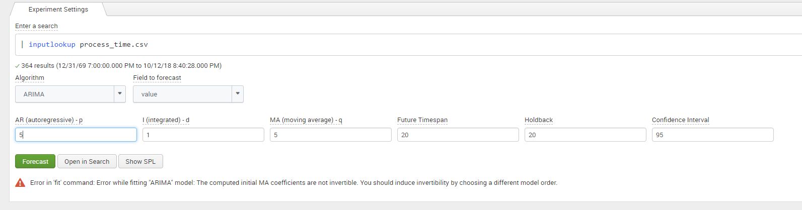
We can now add in the values for the parameter integrated (d) – 1 and our estimates for AR – 4, and MA -5 in the Splunk MLTK. Once added in the assistant, click on ‘Forecast’.
For this particular combination for values we can see that once we click on ‘Forecast’, we get an error regarding the ‘invertability’ of the dataset as shown in the screenshot below. Without going too deep into the mathematics, it means that our model does not converge when it forecasts. I’ve added a link in the references and links section at the end for your interest! This error can be resolved by adjusting the values of model, similar to a ‘trail an error’ approach explained in the next section.
Optimize Your P and Q Values
Estimating this method of AR and MA is subjective to what can be considered as ‘prominent spikes’, this can result in estimating values of ‘q’ and ‘p’ that are not an optimal fit for the data. To resolve this we constructed a table displaying the R-squared and Root Mean Square Error (RMSE) values from the model error statistics from the MLTK assistance, for each combination of ‘p’ and ‘q’. An empty cell indicates an invertability error, while the other cells contain the value of R-squared and RMSE.
A higher R-squared indicates a better fit the model has on the data. R-squared is the amount of variability that the model can explain on the process time data points.
On the other hand, the lower the RMSE is the better the fit of the model. Root mean square is the difference between the data points the model predicted and our holdback points from the raw data.
We pick values of ‘p’ and ‘q’ that minimize RMSE and maximize R-square as the best fit to our data. From the table below we can see that q=5 and p=5 optimize the prediction for us.
Integrated (d) = 0
AutoRegressive (p)
0
1
2
3
4
5
Moving Average (q)
0
R2 Stat: -0.0015
RMSE: 19.31
R2 Stat: 0.1976
RMSE: 16.35
R2 Stat: 0.1977
RMSE: 16.34
R2 Stat: 0.2699
RMSE: 15.60
R2 Stat: 0.2696
RMSE: 15.60
R2 Stat: 0.3114
RMSE: 15.14
1
R2 Stat: 0.2401
RMSE: 15.91
R2 Stat: 0.2486
RMSE: 15.82
R2 Stat: 0.2780
RMSE: 15.51
R2 Stat: 0.2329
RMSE: 15.98
–
R2 Stat: 0.4053
RMSE: 14.07
2
R2 Stat: 0.2452
RMSE: 15.85
–
–
R2 Stat: 0.3017
RMSE: 15.25
R2 Stat: 0.3214
RMSE: 15.03
–
3
R2 Stat: 0.2872
RMSE: 15.41
R2 Stat: 0.4185
RMSE: 13.92
R2 Stat: 0.4428
RMSE: 13.62
R2 Stat:
RMSE:
R2 Stat: 0.4343
RMSE: 13.72
R2 Stat: 0.4456
RMSE: 13.58
4
R2 Stat: 02826
RMSE: 15.46
R2 Stat: 0.4185
RMSE: 13.92
R2 Stat:0.3241
RMSE: 15.00
–
–
–
5
R2 Stat: 0.2826
RMSE: 15.46
R2 Stat: 0.3133
RMSE: 15.99
R2 Stat: 0.4385
RMSE: 13.67
–
–
R2 Stat: 0.4515
RMSE: 13.52
Viewing Your Results
Once we have picked the values of p and q that optimize our model, we can go ahead plug the numbers in our assistant and click on forecast to display the forecasted graph. The values to plug in the assistant are as follows: p-5, d-1, q-5, holdback-20, forecast-20. The screenshots below show the values entered in the assistant and the resulting forecast graph.
A this point many would be satisfied with the forecast as the visual of the data itself is enough to analyse, asses and then make a judgement on the action(s) to take. The next step details how you can view the data and lists some ideas of alerts that can be constructed
Next Step
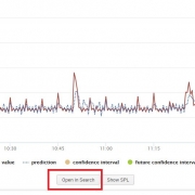
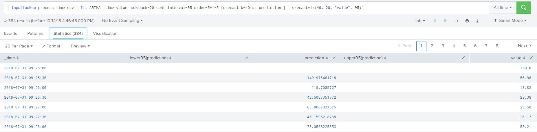
We can view the SPL used powering the graph by either clicking on ‘Open in Search’ or ‘ ‘Show SPL’. I prefer the ‘Open in Search’ option as it automatically open a new tab, allowing me to further understand how the SPL is constructed in the forecast and to view the data. Once a tab browser tab opens click on the ‘statistics’ option to view the raw data points, predicted data points and the confidence intervals created by our model. I have added the SPL from the image for your convenience below:
| inputlookup process_time.csv | fit ARIMA _time value holdback=20 conf_interval=95 order=5-1-5 forecast_k=40 as prediction | `forecastviz(40, 20, "value", 95)`
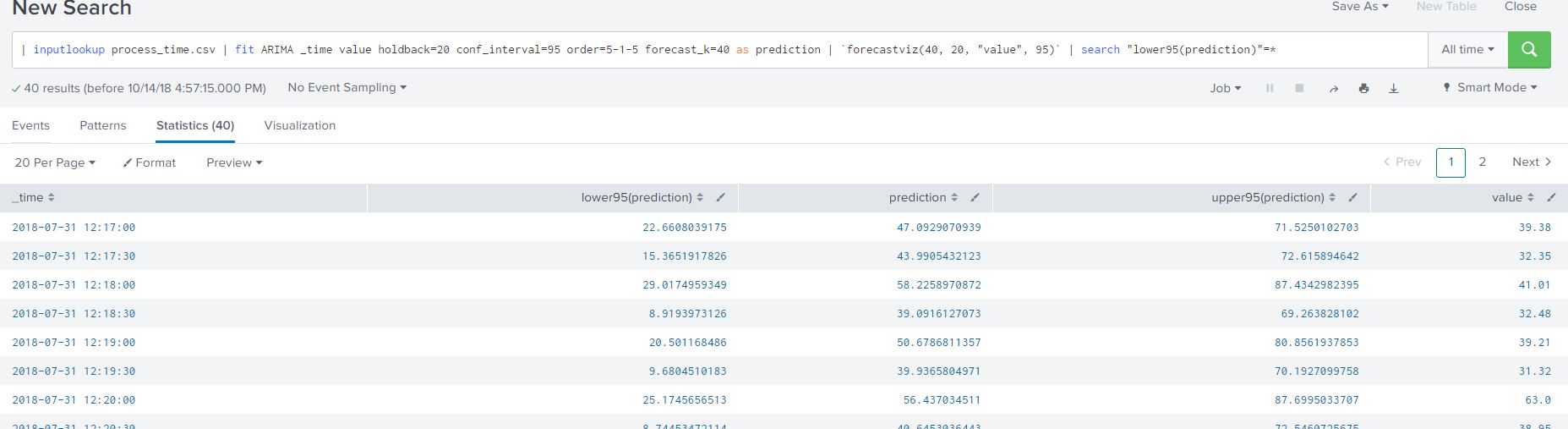
I added another filter to my SPL to only view the forecasted process data from the ARIMA model as shown below:
| inputlookup process_time.csv | fit ARIMA _time value holdback=20 conf_interval=95 order=5-1-5 forecast_k=40 as prediction | `forecastviz(40, 20, "value", 95)` | search "lower95(prediction)"=*
The resulting table lists all the necessary data in a clean tabular format (that we are all familiar with) for creating alerts based on our predicted process time. Here are some ideas on creating alerts based on the data we worked with:
Create alert when the predicted value of the process time goes above a certain threshold
Create alert when the average process time over a timespan is predict to stay above normal limits
Create alert based on outlier detection, when the predicted data is outside the lower or upper boundaries
Creating alerts based on our predict data allows us to be proactive of potential increase or decrease of our input variable
Summarizing ARIMA Forecasting in MLTK
Lets summarize what we have discussed so far in this blog:
A mathematical prerequisites of the model
Determining differencing requirement
Determine starting values for AR() and MA()
Optimize your AR() and MA() values based on error statistics
Forecast your data based on values decided in Step 4
View data and determine any alerts conditions
Prior to the above steps, we need to ensure that our data has been pre-processed or transformed in a MLTK-friendly manner. The pre-process steps include but not limited to; ensuring no gaps in the time series data, determine the relevance of data to forecasting, group data in time intervals (30 second, 1 minute etc). The pre-processing steps are important to create uniformity in the data input allow Splunk’s MLTK to analyse and forecast your data.
Hopefully this blog, streamlines the process of forecasting using ARIMA in Splunk’s MLTK. There are limitations as with any algorithm on forecasting using this method, as it involves a more theoretical knowledge in mathematics I’ve added two links in the the useful links section (first link is navigates you to on ‘datascienceplus.com’ and the second to ’emeraldinsight.com’) to further read on them.
https://discoveredintelligence.com/wp-content/uploads/2018/10/image-14.jpg5341823Discovered Intelligencehttps://discoveredintelligence.com/wp-content/uploads/2013/12/DI-Logo1-300x137.pngDiscovered Intelligence2019-05-06 12:21:352022-10-31 15:35:39Forecasting Time Series Data Using Splunk Machine Learning Toolkit – Part II
With the New Year, and cold winter, now upon us here in Toronto we thought it would be fun to kick it off by revisiting our award winning Hackathon entry from last years Splunk’s Partner Technical Symposium and adapting it to provide insights for our very own Toronto’s Bike Share platform leveraging their Open Data.
https://discoveredintelligence.com/wp-content/uploads/2018/10/Dock-Utilization.png499975Dhiren Meswaniahttps://discoveredintelligence.com/wp-content/uploads/2013/12/DI-Logo1-300x137.pngDhiren Meswania2019-01-11 17:09:492022-10-31 15:38:20Fun with Open Data: Splunking Bike Share Toronto
In this blog we will use a classification approach for predicting Spam messages. A classification approach categorizes your observations/events in discrete groups which explain the relationship between explanatory and dependent variables which are your field(s) to predict. Some examples of where you can apply classification in business projects are: categorizing claims to identify fraudulent behaviour, predicting best retail location for new stores, pattern recognition and predicting spam messages via email or text. Read more
https://discoveredintelligence.com/wp-content/uploads/2018/10/spam_analytics.jpg346346Discovered Intelligencehttps://discoveredintelligence.com/wp-content/uploads/2013/12/DI-Logo1-300x137.pngDiscovered Intelligence2018-10-16 17:44:082022-11-02 13:54:47Predict Spam Using Machine Learning Classification
In this blog we will begin to show how Splunk and the Machine Learning Toolkit can be used with time series data, which is generally the most common type of data that is kept in Splunk! Read more
https://discoveredintelligence.com/wp-content/uploads/2018/08/image-8.jpg435522Discovered Intelligencehttps://discoveredintelligence.com/wp-content/uploads/2013/12/DI-Logo1-300x137.pngDiscovered Intelligence2018-09-25 13:58:292022-10-31 15:44:51Forecasting Time Series Data Using Splunk Machine Learning Toolkit – Part I
In our previous blog we walked through steps on installing the Splunk Machine Learning Toolkit and showcased some of the analytical capabilities of the app. In this blog we will deep dive into an example dataset and use the ‘Predict Numeric Fields’ assistant to help us answer some questions about it.
The sample dataset used is from People’s dataset repository [Houghton] This multivariate sample dataset contains the following fields:
We would like to understand the relationship between ‘Net Sales’ of Green Franchise and how it is impacted by the variables ‘Square Feet of Store’, ‘Inventory’, ‘Amount Spent on Advertising’, ‘Size of Sales District’ & ‘No of Competitors’. E.g Would an increase in ‘Inventory’ or ‘Amount Spent on Advertising’ increase or decrease ‘Net Sales’ for Greens?
The next few sections will walk you through uploading the data set and processing it in the Machine Learning Toolkit App.
Uploading the Sample Data Set
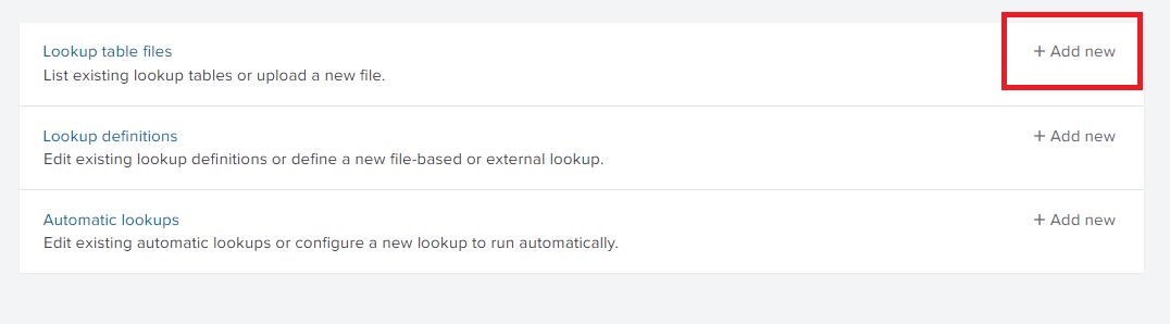
The CSV file was uploaded to Splunk from Settings -> Lookups -> Lookup table files (Add new). If you need more information on this step please consult the Splunk Docs here. Save the CSV file as greenfranchise.csv
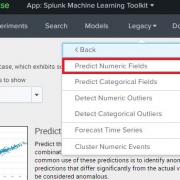
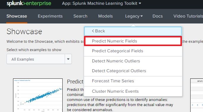
Once the file has been uploaded and saved as greenfranchise.csv, navigate to the Splunk Machine Learning Toolkit App, click on the ‘Legacy’ menu, Assistants and open the ‘Predict Numeric Fields’ Assistant. This screenshot and navigation may differ depending on which version of Splunk and the MLTK is installed. Assistants in version 3.2 can be found under the ‘Legacy’ tab.
App: Splunk Machine Learning Toolkit
Populate Model Fields
In the Create New Model tab, you can view the contents of the CSV file by running the below Splunk Query in the Search bar:
| inputlookup greenfranchise.csv
This will automatically populate the panels with the fields in the csv file. Below the “Preprocessing Steps” we can see a second panel to choose the type of algorithm to apply to this lookup.
Selecting the Algorithm
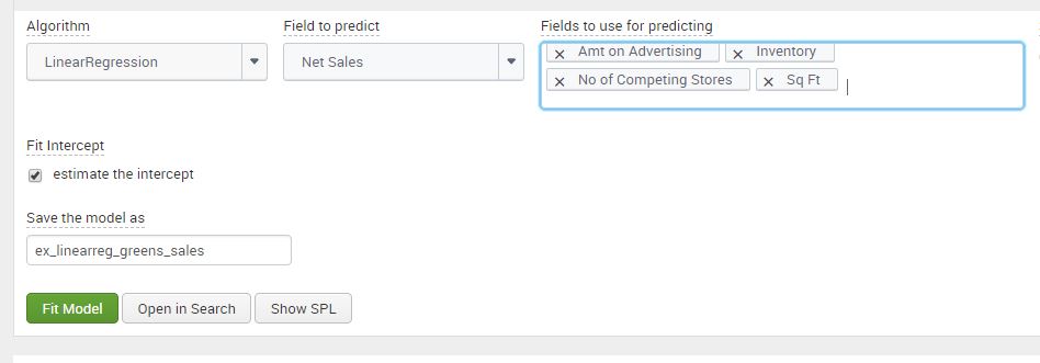
In the panel for selecting the algorithm, we can see the ‘Fields to predict’ and ‘Fields to use for predicting’ fields are automatically populated from the data. For this test we use the linear regression algorithm to forecast the ‘Net Sales’ of Green Franchises. Select “Net Sales” as the Field to predict, and in the Fields to use for predicting, select all of the remaining fields except for “Size of Sales District”.
If you’re interested in the math behind it, linear regression from the Machine Learning Toolkit will provide us with the Beta (relationship) co-efficient between ‘Net Sales’ and each of the fields. The residual of regression model is the difference between the explanatory/input variables and the predicted equation at each data point, which can be used for further analysis of the model.
Fitting Model
Once the Fields have been picked, you need to determine the ‘Split for Training’ ratio for the model. Select ‘No Split’ for the model to use all the data for creating a model. The split option allows the user to divide the data for training and testing. This means that X% of the data will used to create our model, and (100-X) % of the data withheld will be used to test the model.
Click on ‘Fit Model’ after setting the Split for the data. Splunk processes the data to display visuals which we can use to analyze the data. Name the model ‘ex_linearreg_greens_sales’, however, based on the users data, the model name should reflect the field to predict, the type of algorithm and the user it is assigned to, to reduce ambiguity on the models ownership and purpose.
Analyzing the Results
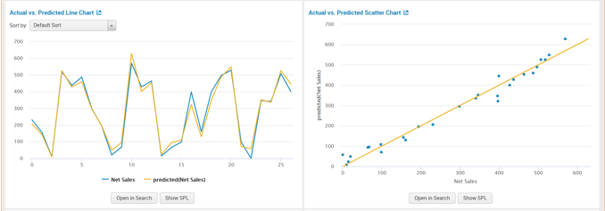
The first two panels show a Line and Scatter Chart of “Actual vs Predicted” data. Both panels present one of the richest methods to analyze the linear regression model. From the scatter and line plot we can observe that the data fits well. We can determine that there is a strong correlation between the model’s predictions and the actual results. Since the model has more than one input variable, examining the residual line chart and histogram next, will give us a more practical understanding.
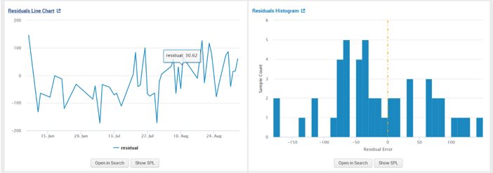
The second set of panels that we can use to analyse the model are residuals from the plot. From observing the “Residual Line Chart” and “Residual Histogram” we can see that there is large deviation from the center and the residuals appear to be scattered. A random scattering of the data points around the horizontal (x-axis) line signifies a good fit for the linear model. Otherwise, a pattern shape of the data points would indicate that a non-linear model from the MLTK should be used instead.
The last set of panels show us the R-squared of the model. The closer the value is to 1, better the fit of the regression model. The “Fit Model Parameters Summary” panel gives us the ‘Beta’ coefficients discussed in the ‘Selecting the Algorithm’ section. The assistant displays the data in a well-grounded and systematic setting. After analyzing the macro fit of the model, we can use the co-efficient of the variables create our equation for predicting ‘Net Sales’ :
In the last panel shown below, we can see our input variables under ‘Fit Model Parameters Summary’ and their values. We will assess in the next section on using these input variables to predict ‘Net_Sales‘.
Answering the Question: How is ‘Net Sales’ impacted by the Variables?
We can view the results of the model by running the following search:
| summary "ex_linearreg_greens_sales"
This Query will return the coefficients values of the linear regression algorithm. In our example for Greens, we observed that variable ‘X4’ are the number of competitors stores, an increment in competitors stores will reduce the ‘Net Sales‘ by approximately 12.62. While the variable ‘X5’ is the Sq Feet of the Store, and increment will increase the ‘Net Sales’ by approximately 23.69.
We can use the results from our model to forecast ‘Net Sales’ if the input variables (Sq Ft, Amt on Advertising etc) were different using the below Splunk search:
| makeresults | eval "Sq Ft"=5.8, Inventory=700, "Amt on Advertising"=11.5,"No of Competing Stores"=20 | apply ex_linearreg_greens_sales as "Predicted_Net_Sales"
We used makeresults to work our own values for the input variables. Once the fields have been defined we used the apply command in the MLTK to output the predicted value of the ‘Net Sales’ given the new values of the input variables. The apply command uses the ouput values the model learnt from the csv dataset and applies them to new information. We used the ‘as’ command to alias the name of the predicted field as ‘Predicted_Net_Sales’. From the below screenshot we can observe that; 11.5 on Advertising, 700 on Inventory, 20 Competing stores nearby and 5.8 square feet of space predicts a Net Sales of approximately 306. Please note that all monetary variables are in $1,000 .
Summary
So to recap, we followed the following steps to answer our question of the data:
Uploaded the sample data set
Populated the model fields
Selected an algorithm
Fit the model
Analyzed the results
The Splunk Machine Learning Toolkit simplifies the steps for data preparation, reduces the steps needed to create a model, and saves the history of models we have executed and tested with. We can review the data before applying the algorithms allowing the user to standardize and adjust using MLTK capabilities or Splunk queries. The resulting statistic of the ‘Predict Numeric Fields’ assistant allows us to understand the dataset using machine learning.
https://discoveredintelligence.com/wp-content/uploads/2018/01/image-2.jpg377684Discovered Intelligencehttps://discoveredintelligence.com/wp-content/uploads/2013/12/DI-Logo1-300x137.pngDiscovered Intelligence2018-06-07 11:00:262022-11-04 14:47:47A Practical Example Using The Splunk Machine Learning Toolkit
A week ago, I had the privilege of attending the annual Splunk Partner Technical Symposium in New Orleans along with a colleague. At this event, we entered and won the 1st annual IoT Hackathon, sponsored by AWS. The Hackathon tasked us with developing an IoT fleet management solution using Ford GoBike IoT (Internet of Things) data. This post outlines the developed solution and the various data sources and tools we used. Overall, it was a great and fun exercise and helps illustrate how feature rich solutions can be developed in a very short amount of time using Splunk Enterprise. Read more
https://discoveredintelligence.com/wp-content/uploads/2018/05/fleet_operations.jpg18321500Discovered Intelligencehttps://discoveredintelligence.com/wp-content/uploads/2013/12/DI-Logo1-300x137.pngDiscovered Intelligence2018-05-11 18:34:542025-12-17 16:31:55Creating an IoT Fleet Management Solution using Splunk