Splunk 6.6 New Features – Part IV – Trellis Layout Visualization
In this post, we will walk through some use cases and data formats to configure the new Trellis Layout Visualization in Splunk 6.6.
The new Trellis Layout Visualization for Splunk 6.6 has the ability to split search results to display several similar visualizations in one panel. Trellis layout can be helpful to monitor and compare multiple results without creating several panels. For example, you can generate a search query to create a metric split by a field type and then split the visual on the field.
The first step to using the layout is understanding the field(s) that you want to split your search results by. You can split your field(s) using aggregate functions such as ‘stats’ or ‘timechart’.
Split by Single factor
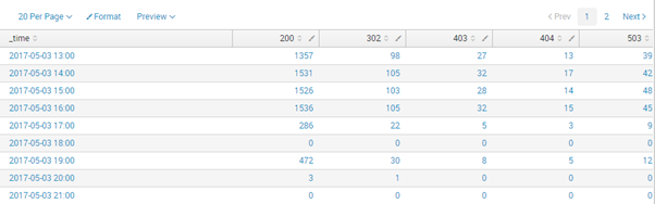
In the below search the data is aggregated by count of clientip events with time as the x-axis and the field split by ‘status’.
index=main status=*
| timechart span =1h count(clientip) by status
Resulting in a statistical table:
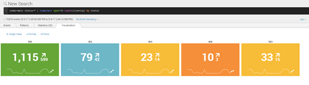
Navigate to the Visualization tab, select the Single Value visualization and from the Trellis Option select the Trellis Layout.
This displays a single visualization splitting the count of clientip by the http status codes they encountered on our webpage.
Split by two-factors
Trellis Layout lets you select the field to ‘split by’. In the below search, the count of events is split by category and Country.
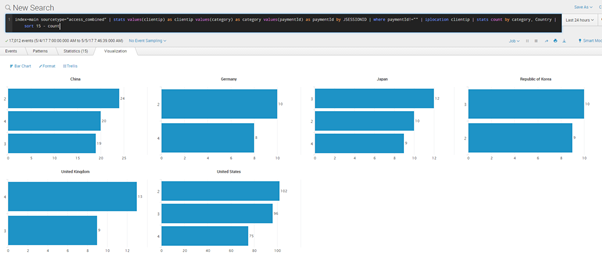
index=main sourcetype="access_combined"
| stats values(clientip) as clientip values(category) as category values(paymentId) as paymentId by JSESSIONID
| where paymentId!=""
| iplocation clientip
| stats count by category, Country
| sort 15 – count
In the visual, I’ve selected the trellis layout to split by category. The resulting panel shows the top 15 products quantities sold split by the product category. This visual will allows management to make comparisons of product categories without having to create multiple searches or panels.
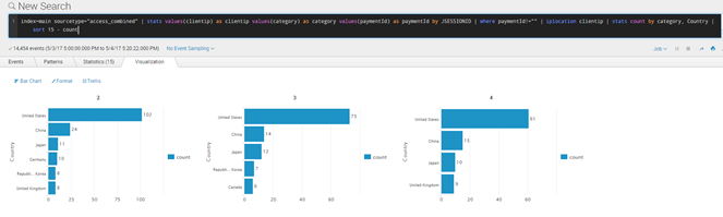
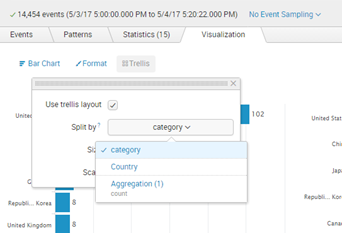
Now, we click on the trellis option, we find a drop-down option showing the fields that we can split the aggregation by. I then configured the visual to split the data by Country rather than category.
The resulting layout is the converse of the previous layout and we now see the top 15 product quantities sold, split by Country.
Overall, this is a nice addition to Splunk and new visualizations are always very welcome. There are several advantages to creating visuals using the trellis layout, such as the ability to picking your type of visual and a lower search-time impact, as multiple charts can be displayed from one search. If you would like further information on Trellis Layout you can read the Splunk Documentation here: https://docs.splunk.com/Documentation/Splunk/latest/Viz/VisualizationTrellis.
Looking to expedite your success with Splunk? Click here to view our Splunk service offerings.
© Discovered Intelligence Inc., 2017. Unauthorised use and/or duplication of this material without express and written permission from this site’s owner is strictly prohibited. Excerpts and links may be used, provided that full and clear credit is given to Discovered Intelligence, with appropriate and specific direction (i.e. a linked URL) to this original content.


