Quick Guide to Outlier Detection in Splunk
There are multiple (almost discretely infinite) methods of outlier detection. In this blog I will highlight a few common and simple methods that do not require Splunk MLTK (Machine Learning Toolkit) and discuss visuals (that require the MLTK) that will complement presentation of outliers in any scenario. This blog will cover the widely accepted method of using averages and standard deviation for outlier detection. The visual aspect of detecting outliers using averages and standard deviation as a basis will be elevated by comparing the timeline visual against the custom Outliers Chart and a custom Splunk’s Punchcard Visual.
Some Key Concepts
Understanding some key concepts are essentials to any Outlier Detection framework. Before we jump into Splunk SPL (Search Processing Language) there are basic ‘Need-to-know’ Math terminologies and definitions we need to highlight:
- Outlier Detection Definition: Outlier detection is a method of finding events or data that are different from the norm.
- Average: Central value in set of data.
- Standard Deviation: Measure of spread of data. The higher the Standard Deviation the larger the difference between data points. We will use the concept of standard substantially in today’s blog. To view the manual method of standard deviation calculation click here.
- Time Series: Data ingested in regular intervals of time. Data ingested in Splunk with a timestamp and by using the correct ‘props.conf’ can be considered “Time Series” data
Additionally, we will leverage aggregate and statistic Splunk commands in this blog. The 4 important commands to remember are:
- Bin: The ‘bin’ command puts numeric values (including time) into buckets. Subsequently the ‘timechart’ and ‘chart’ function use the bin command under the hood
- Eventstats: Generates statistics (such as avg,max etc) and adds them in a new field. It is great for generating statistics on ‘ALL’ events
- Streamstats: Similar to ‘stats’ , streamstats calculates statistics at the time the event is seen (as the name implies). This feature is undoubtedly useful to calculate ‘Moving Average’ in additional to ordering events
- Stats: Calculates Aggregate Statistics such as count, distinct count, sum, avg over all the data points in a particular field(s)
Data Requirements
The data used in this blog is Splunk’s open sourced “Bots 2.0” dataset from 2017. To gain access to this data please click here. Downloading this data set is not important, any sample time series data that we would like to measure for outliers is valid for the purposes of this blog. For instance, we could measure outliers in megabytes going out of a network OR # of logins in a applications using the using the same type of Splunk query. The logic used to the determine outliers is highly reusable.
Using SPL
There are four methods commonly seen methods applied in the industry for basic outlier detection. They are in the sections below:
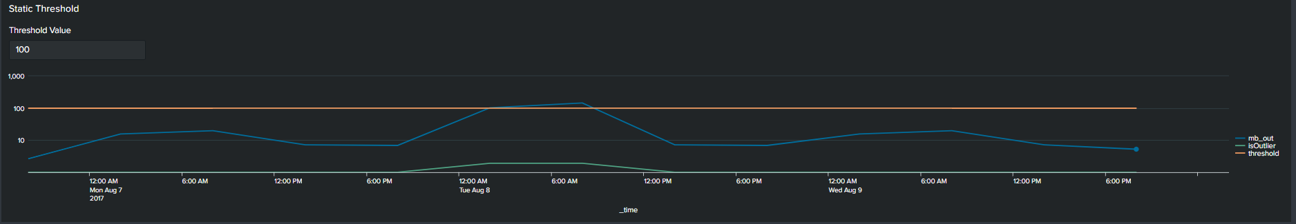
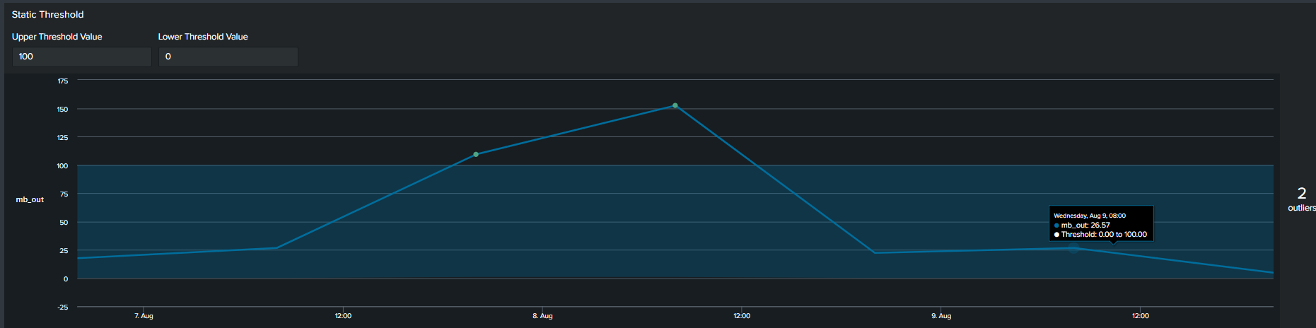
1. Using Static Values
The first commonly used method of determining an outlier is by constructing a flat threshold line. This is achieved by creating a static value and then using logic to determine if the value is above or below the threshold. The Splunk query to create this threshold is below :
<your spl base search> … | timechart span=6h sum(mb_out) as mb_out
| eval threshold=100
| eval isOutlier=if('mb_out' > threshold, 1, 0)
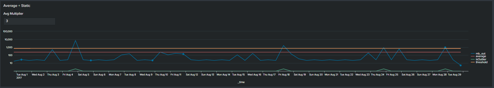
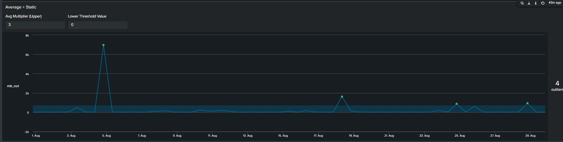
2. Average with Static Multiplier
In addition to using arbitrary static value another method commonly used method of determining outliers, is a multiplier of the average. We calculate this by first calculating the average of your data, following by selecting a multiplier. This creates an upper boundary for your data. The Splunk query to create this threshold is below:
<your spl base search> …
| timechart span=12h sum(mb_out) as mb_out
| eventstats avg("mb_out") as average
| eval threshold=average*2
| eval isOutlier=if('mb_out' > threshold, 1, 0)
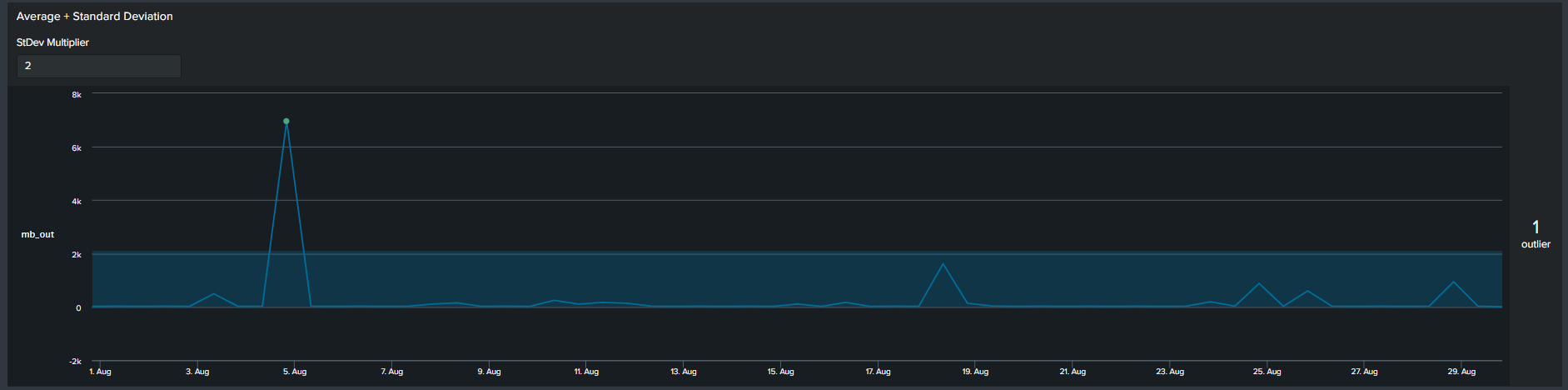
3. Average with Standard Deviation
Similar to the previous methods, now we use a multiplier of standard deviation to calculate outliers. This will result in a fixed upper and lower boundary for the duration of the timespan selected. The Splunk query to create this threshold is below:
<your spl base search> ... | timechart span=12h sum(mb_out) as mb_out
 | eventstats avg("mb_out") as avg stdev("mb_out") as stdev
 | eval lowerBound=(avg-stdev*exact(2)), upperBound=(avg+stdev*exact(2))
 | eval isOutlier=if('mb_out' < lowerBound OR 'mb_out' > upperBound, 1, 0)
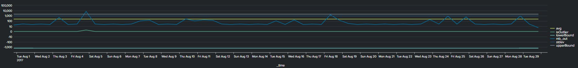
Notice that with the addition of the lower and upper boundary lines the timeline chart becomes cluttered.
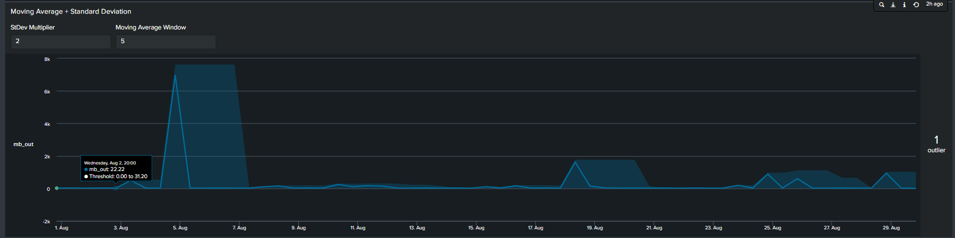
4. Moving Averages with Standard Deviation
In contrast to the previous methods, the 4th most common method seen is by calculating moving average. In short, we calculate the average of data points in groups and move in increments to calculate an average for the next group. Therefore, the resulting boundaries will be dynamic. The Splunk search to calculate this is below:
<your spl base search> ... | timechart span=12h sum(mb_out) as mb_out
 | streamstats window=5 current=true avg("mb_out") as avg stdev("mb_out") as stdev
 | eval lowerBound=(avg-stdevexact(2)), upperBound=(avg+stdevexact(2))
 | eval isOutlier=if('mb_out' < lowerBound OR 'mb_out' > upperBound, 1, 0)

Tips: Notice the “isOutliers” line in the timeline chart, in order to make smaller values more visible format the visual by changing the scale from linear to log format.
Using the MLTK Outlier Visualization
Splunk’s Machine Learning Toolkit (MLTK) contains many custom visualization that we can use to represent data in a meaningful way. Information on all MLTK visuals detailed in Splunk Docs. We will look specifically at the ‘Outliers Chart’. At the minimum the outlier chart requires 3 additional fields on top of your ‘_time’ & ‘field_value’. First, would need to create a binary field ‘isOutlier’ which carries the value of 1 or 0, indicating if the data point is an outlier or not. The second and third field are ‘lowerBound’ & ‘upperBound’ indicating the upper and lower thresholds of your data. Because the outliers chart trims down your data by displaying only the value of data point and your thresholds, we can conclude through use that it is clearer and easier to understand manner. As a recommendation it should be incorporated in your outliers detection analytics and visuals when available.
Continuing from the previous paragraph, take a look at the below snippets at how the impact the outliers chart is in comparison to the timeline chart. We re-created the same SPL but instead of applying timeline visual applied the ‘Outliers Chart’ in the same order:
| Advantages | Disadvantages |
| Cleaner presentation and less clutter | You need to install Splunk MLTK (and its pre-requisites) to take advantage of the outliers chart |
| Easier to understand as determining the boundaries becomes intuitive vs figuring out which line is the upper or lower threshold | Unable to append additional fields in the Outliers chart |
Adding Depth to your Outlier Detection
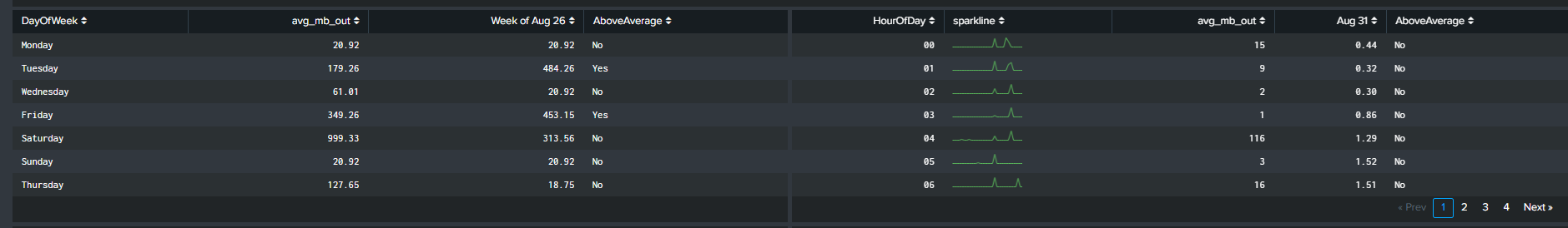
Determining the best technique of outlier detection can become a cumbersome task. Hence, having the right tools and knowledge will free up time for a Splunk Engineer to focus on other activities. Creating static thresholds over time for the past 24hrs, 7 days, 30 days may not be the best approach to finding outliers. A different way to measure outliers could be by looking at the trend on every Monday for the past month or 12 noon everyday for the past 30 days. We accomplish this by using two simple and useful eval functions:
| eval HourOfDay=strftime(_time, "%H")
| eval DayOfWeek=strftime(_time, "%A")
Using Eval Functions in SPL
Continuing from the previous section, we incorporate the two highlighted eval functions in our SPL to calculate the average ‘mb_out’. However, this time the average is based on the day of the week and the hour of the day. There are a handful of advantages of this method:
- Extra depth of analysis by adding 2 additional fields you can split the data by
- Intuitive method of understanding trends
Some use cases of using the eval functions are as follows:
- Network activity analysis
- User behaviour analysis
Visualizing the Data!
We will focus on two visualizations to complement our analysis when utilizing the eval functions. The first visual, discussed before, is the ‘Outliers Chart’ which is a custom visualization in Splunk MLTK. The second visual is another custom visualization ‘PunchCard’, it can be downloaded from Splunkbase here (https://splunkbase.splunk.com/app/3129/).
The outliers chart has a feature which results in a ‘swim lane’ view of a selected field/dimension and your data points while highlighting points that are outliers. To take advantage of this feature, we will use a Macro “splitby” which creates a hidden field(s) “_<Field(s) you want data to split by>”. The rest of the SPL is shown below
< your base SPL search >... | eventstats avg("mb_out") as avg stdev("mb_out") as stdev by "HourOfDay" | eval avg=round(avg,2) | eval stdev=round(stdev,2) | eval lowerBound=(avg-stdev*exact(2)), upperBound=(avg+stdev*exact(2)) | eval isOutlier=if('mb_out' < lowerBound OR 'mb_out' > upperBound, 1, 0) | `splitby("HourOfDay")` | fields _time, "mb_out", lowerBound, upperBound, isOutlier, * | fields - _raw source kb* byt* | table _time "mb_out" lowerBound upperBound isOutlier *
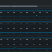
This search results in an Outlier Chart that looks like this:
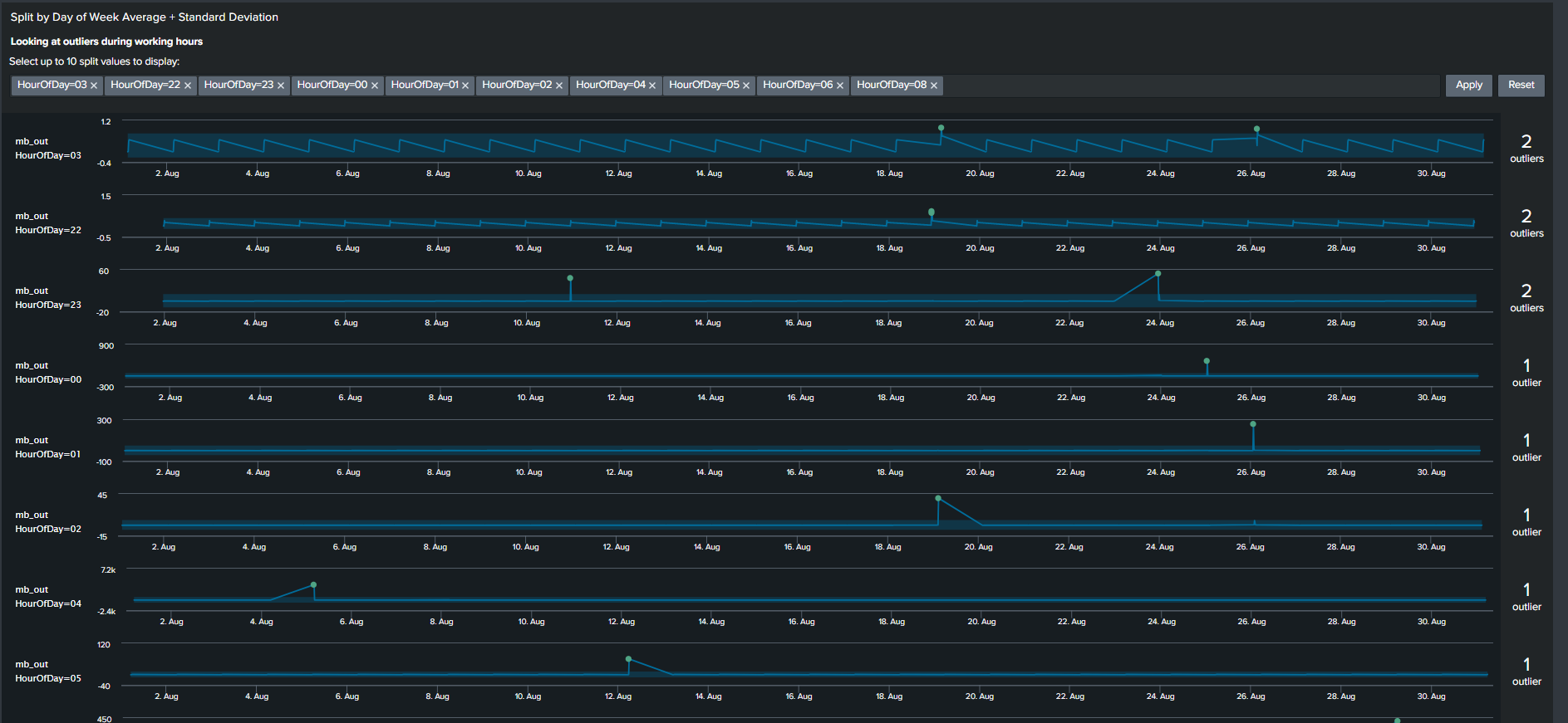
The Outliers Chart has the capability to split by multiple fields, however in our example splitting it by a single dimension “HourOfDay” is sufficient to show its usefulness.
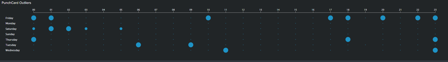
The PunchCard visual is the second feature we will use to visualize outliers. It displays cyclical trends in our data by representing aggregated values of your data points over two dimensions or fields. In our example, I’ve calculated the sum of outliers over a month based on “DayOfWeek” as my first dimension and “HourOfDay” as my second dimension. I’ve adding the outliers of these two fields and displaying it using the PunchCart visual. The SPL and image for this visual is show below:
< your base SPL search > ... | streamstats window=10 current=true avg("mb_out") as avg stdev("mb_out") as stdev by "DayOfWeek" "HourOfDay"
| eval avg=round(avg,2)
| eval stdev=round(stdev,4)
| eval lowerBound=(avg-stdevexact(2)), upperBound=(avg+stdevexact(2))
| eval isOutlier=if('mb_out' < lowerBound OR 'mb_out' > upperBound, 1, 0)
| splitby("DayOfWeek","HourOfDay")
| stats sum(isOutlier) as mb_out by DayOfWeek HourOfDay
| table HourOfDay DayOfWeek mb_out
Summary and Wrap Up
Trying to find outliers using Machine Learning techniques can be a daunting task. However I hope that this blog gives an introduction on how you can accomplish that without using advanced algorithms. Consequently, using basic SPL and built-in statistic functions can result in visuals and analysis that is easier for stakeholders to understand and for the analyst to explain. So summarizing what we have learnt so far:
- One solution does not fit all. There are multiple methods of visualizing your analysis and exploring your result through different visual features should be encouraged
- Use Eval functions to calculate “DayOfWeek” and “HourOfDay” wherever and whenever possible. Adding these two functions provides a simple yet powerful tool for the analyst to explore the data with additional depth
- Trim or minimize the noise in your Outliers visual by using the Outliers Chart. The chart is beneficial in displaying only your boundaries and outliers in your data while shaving all other unnecessary lines
- Use “log” scale over “linear” scale when displaying data with extremely large ranges
© Discovered Intelligence Inc., 2020. Unauthorised use and/or duplication of this material without express and written permission from this site’s owner is strictly prohibited. Excerpts and links may be used, provided that full and clear credit is given to Discovered Intelligence, with appropriate and specific direction (i.e. a linked URL) to this original content.