The Splunk Machine Learning Toolkit is packed with machine learning algorithms, new visualizations, web assistant and much more. This blog sheds light on some features and commands in Splunk Machine Learning Toolkit (MLTK) or Core Splunk Enterprise that are lesser known and will assist you in various steps of your model creation or development. With each new release of the Splunk or Splunk MLTK a catalog of new commands are available. I attempt to highlight commands that have helped in some data science or analytical use-cases in this blog.
https://discoveredintelligence.com/wp-content/uploads/2020/10/image-10.png2561892Discovered Intelligencehttps://discoveredintelligence.com/wp-content/uploads/2013/12/DI-Logo1-300x137.pngDiscovered Intelligence2020-11-12 20:24:382022-10-31 14:41:21Interesting Splunk MLTK Features for Machine Learning (ML) Development
This blog post is not technical in nature whatsoever, it’s simply a fun story about two passions; Becoming a first time father and Splunk. So sit back, grab your beverage of choice and let me tell you a little data story about how I Splunk’d myself Becoming a Dad.
I never really expected to share this story but earlier this summer I had the opportunity to speak in front (well, virtually of course) of my fellow SplunkTrust members at the SplunkTrust Summit so I thought why not share the story about how I decided to use Splunk to understand what it was like becoming a dad for the first time. Ok, but why am I only blogging about this now, especially since my son is now 2 years old? Well Splunk .conf20 has just come to a close and I was inspired by a lot of the fun use cases and stories being shared in the Data Playground and I thought it was time to sit down and write about my data story.
Now if you’d simply prefer to watch my presentation from the SplunkTrust Summit rather than read about it here, you can certainly do so by navigating to the video on our YouTube channel.
Before I begin, I must also give a shout out to my amazing wife, Rachel, who without her strength and positivity this data story simply would not be possible.
The “News”
In early January 2018 my wife shared with me the exciting news that we were going to be first time parents. Naturally in the days, weeks, heck even months to follow a lot of questions entered my mind; What is it like? How to prepare? What to expect? and so on. Well of course, everywhere you turn everyone has their own experience to share but it’s exactly that, their own experience. So I thought, when someone asks me about my experience in the future I want to have the best understanding possible. I want to be able to look back at it, better understand what it was like and have the ability to ask questions of the experience after the fact so, of course, why not Splunk becoming a dad? And that’s exactly what I did.
The Questions
To know where to begin I started out with asking myself, what questions would I want to answer about the process of becoming a dad? When talking to other parents about their experience no one ever shied away from sharing the ups and downs, “I slept only one hour a night” … “The experience was beautiful, no stress” … “It all happened real fast” and so on.
So I thought what if for myself I could answer some of these basic questions:
Am I even getting any sleep?
Is my sleep consistent or just completely broken?
Am I getting any exercise walking and carrying our new baby around?
What was my heart rate like leading up, during the birth and after?
Did I experience a high heart rate (stress) during certain milestones of the process?
The Data
To answer the questions knowing what was a head of me, I really wanted to focus on keeping the data collection simple and not have to worry about instrumenting much or having something break and lose out on that data collection. So to achieve that simplicity I bought myself a Fitbit Alta HR. The Fitbit was capable of tracking heart rate, sleep, calories burned and of course steps all while having good battery life with a small and comfortable design.
I collected the Fitbit data by writing a simple python script to call the Fitbit API and collect all of the stats I was looking for.
Admittedly, I did have one other data set to work with after my son was born that I did not foresee at all and that was his diaper change log written out as a Splunk lookup. Yup, I went that far.
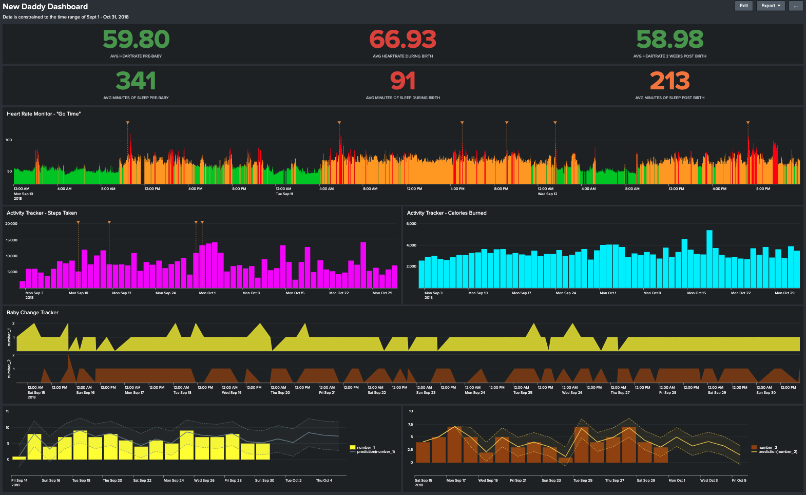
The New Daddy Dashboard
After my son was born and all of the data had been collected and indexed in Splunk (don’t worry, I waited a month to do this, it wasn’t immediately after he was born :)) it was time to begin to answers those questions that I started out with and build myself a dashboard.
Enter The New Daddy Dashboard, a visual representation of the questions I wanted to originally answer and more questions I realized I had after I had the data. The data spans the three weeks before my son was born up to six weeks after.
There is certainly a lot going on within this dashboard so let’s break it down.
First, I started off with averaging out my heart rate and sleep. This is broken out into three time range’s, the time leading up to my son being born (“Pre-Baby”), the 48 hours when he was born (“During Birth”) and the two weeks following (“Post Birth”).
The questions we are answering here were, am I getting any sleep and how was my heart rate? Well it went pretty much as I expected, the 48 hour period during birth my average heart rate shot up and my sleep was almost non-existent each day. No real surprises there however you will notice that my average minutes of sleep post-birth dropped quite a bit from where it was pre-baby. Needless-to-say I did not really take the advice of “sleep when your baby sleeps” and it cost me.
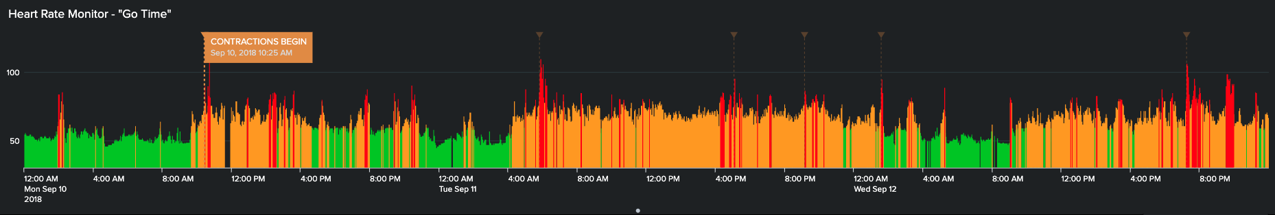
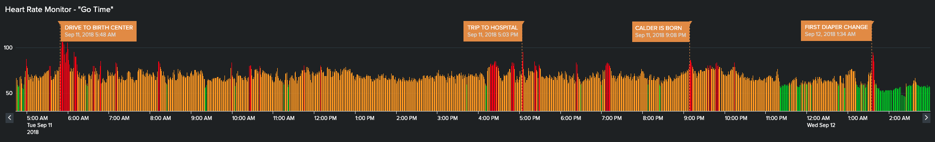
Next, I was interested to see how I handled what I call “Go Time”, which you guessed it, labour is happening, baby is coming and ultimately the baby is here. What I created was a visualization charting my heart rate over this time frame; green representing a normal heart rate range, yellow a moderately high heart rate and red being a very high heart rate. Additionally on this chart I added annotations to mark each major “milestone” of the experience.
What I could see here is what I kind of expected of myself, my heart rate would quickly rise as the stress grew with each major milestone encountered; labour starting, driving to the birth center, the trip to the hospital, my son’s birth, my first ever diaper change and our first few hours after leaving the hospital.
If we zoom in on this timeline you can see the correlation of high heart rate to milestone much clearer and how after leaving our home for the birth center my heart rate rarely ever went down until after I changed my first ever diaper and thought ‘ok, I got this’.
Now that I knew the answer to the question “Did I experience stress during this process?” it was time to move on to figure out if I actually got any exercise. Again, an answer that probably is not going to be shocking at all.
Looking at these charts what I could see was that exercise came and went. The couple days that we spent at the hospital after my son was born there was a good bit of walking mainly for the desire to be out of the hospital room. Then really after that exercise went out the window with funny enough the only consecutive spikes in the chart were for when I attended Splunk .conf18 in Orlando.
To round out The New Daddy Dashboard I decided to have a little bit of fun with that unexpected data set I mentioned earlier. I created a set of charts which I called the Baby Change Tracker, for you guessed it, diaper changes. Even writing this now it still makes me laugh that my wife and I tracked this.
I’m pretty sure the colors are a dead give away about the data so I wont elaborate on that but what I was trying to see here was two fold; were there any consistencies or patterns to the types of activity driving the diaper change and could we start to predict and forecast the diaper changes?
Where I landed with this analysis was that, although we could start to see patterns in the data I still had a very unpredictable baby, as Im sure we all do, but in the end (no pun intended) it was still fun to visualize this data and this blog post is something I’m sure my son will look back on one day and go ‘why dad, why?!‘.
What I Discovered Becoming a Dad
In the end what did I discover and what did Splunk show me about becoming a dad?
Get exercise before hand; your heart will thank you.
Expect the unexpected; there’s very little predictability.
You’ll get little-to-no Sleep; but take whatever you can get!
https://discoveredintelligence.com/wp-content/uploads/2020/10/new-daddy-dashboard.png9641570Joshhttps://discoveredintelligence.com/wp-content/uploads/2013/12/DI-Logo1-300x137.pngJosh2020-10-22 19:40:472022-11-02 13:18:22Becoming a Dad: A Data Story using Splunk
Every organization deals with sensitive data like Personally Identifiable Information (PII), Customer Information, Propriety Business Information…etc. It is important to protect the access to sensitive data in Splunk to avoid any unnecessary exposure of it. Splunk provides ways to anonymize sensitive information prior to indexing through manual configuration and pattern matching. This way data is accessible to its users without risking the exposure of sensitive information. However, even in the best managed environments, and those that already leverage this Splunk functionality, you might at one point discover that some sensitive data has been indexed in Splunk unknowingly. For instance, a customer facing application log file which is actively being monitored by Splunk may one day begin to contain sensitive information due to a new application feature or change in the application logging.
This post provides you with two options for handling sensitive data which has already been indexed in Splunk.
Option 1: Selectively delete events with sensitive data
The first, and simplest, option is to find the events with sensitive information and delete them. This is a suitable choice when you do not mind deleting the entire event from Splunk. Data is marked as deleted using the Splunk ‘delete’ command. Once the events are marked as deleted, they are not going to be searchable anymore.
As a pre-requisite, ensure that the account used for running the delete command has the ‘delete_by_keyword’ capability. By default, this capability is not provided to any user. Splunk has a default role ‘can_delete’ with this capability selected, you can add this role to a user or another role (based on your RBAC model) for enabling the access.
Steps:
Stop the data feed so that it no longer sends the events with sensitive information.
Search for the events which need to be deleted.
Confirm that the right events are showing up in the result. Pipe the results of the search to delete command.
Verity that the events deleted are no longer searchable.
Note: The delete command does not remove the data from disk and reclaim the disk space, instead it hides the events from being searchable.
Option 2: Mask the sensitive data and retain the events
This option is suitable when you want to hide the sensitive information but do not want to delete the events. In this method we use rex command to replace the sensitive information in the events and write them to a different index.
The summary of steps in this method are as follows:
Stop the data feed so that it no longer sends the events with sensitive information.
Search for the intended data.
Use rex in sed mode to substitute the sensitive information.
Create a new index or use an existing index for masked data.
With the collect command, save the results to a different index with same sourcetype name.
Delete the original (unmasked) data using the steps listed in Option 1 above.
As mentioned in Option 1 above, ensure that the account has the ‘delete_by_keyword’ capability before proceeding with the final step of deleting the original data.
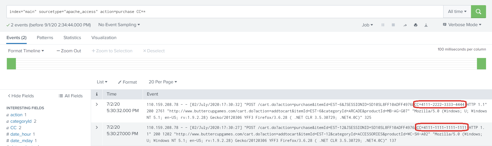
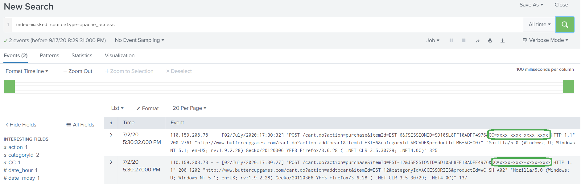
Let’s walk through this procedure using a fictitious situation. Let us take an example of an apache access log monitored by Splunk. Due to a misconfiguration in the application logging, the events of the log file started registering customer’s credit card information as part of the URI.
Steps:
Disable the data feed which sends sensitive information.
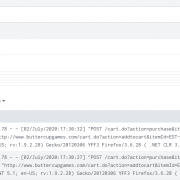
Search for the events which contains the sensitive information. As you can see in the screenshot, the events have customer’s credit card information printed.
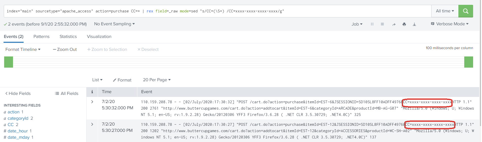
3. Use the rex command with ‘sed’ mode to mask the CC value at search time.
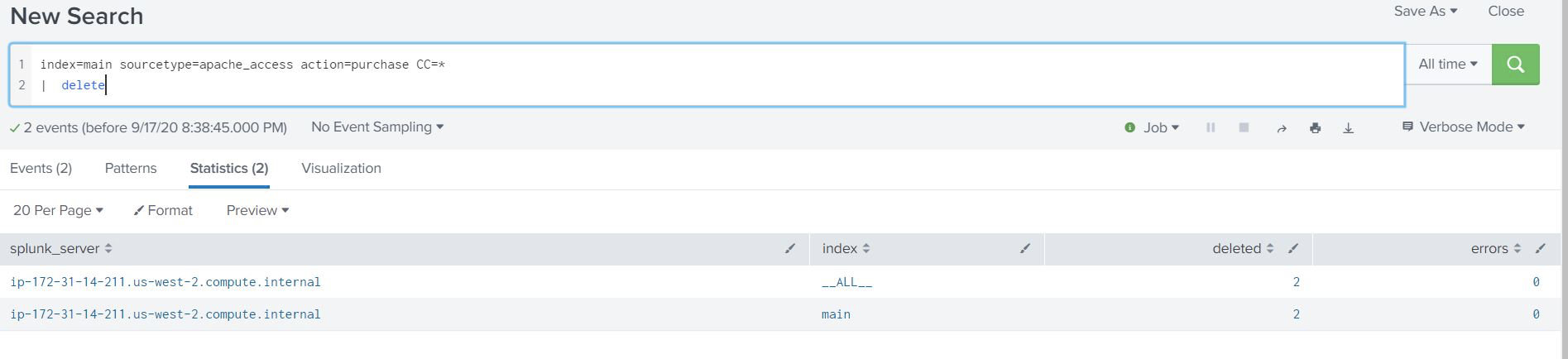
index="main" sourcetype="apache_access" action=purchase CC=*
| rex field=_raw mode=sed "s/CC=(\S+)/CC=xxxx-xxxx-xxxx-xxxx/g"
The highlighted regular expression matches the credit card number and replaces it with its new masked value of ‘xxxx’.
4. Verify that the sensitive information is replaced with the characters provided in rex command.
5. Pipe the results of the search to ‘collect’ command to send the masked data to a different index with same sourcetype.
6. Verify the masked data has been properly indexed using the collect command and is now searchable.
Note: Adjust the access control settings so that the users can access the masked data in the new/different index.
7. Once all events have been moved over to the new index, we need to delete the original data from the old index by running the delete command.
As mentioned earlier, ensure that you have capabilities to run ‘delete’ command.
8. Verify that data has been deleted by searching for it, as noted in Step 2 above.
9. Remove the ‘delete_by_keyword’ capability from the user/role now that the task is completed.
What Next?
Enable Masking at Index Time
It is always ideal to configure application logging in such a way that it does not log any sensitive information. However, there are exceptions where you cannot control that behavior. Splunk provides two ways to anonymize/mask the data before indexing it. Details regarding the methods available can be found within the Splunk documentation accessible through the URL below:
Additionally, products such as Cribl LogStream (free up to 1TB/day ingest) provide a more complete, feature-rich, solution for masking data before indexing it in Splunk.
Audit Sensitive Data Access
Finally, if you have unintentionally indexed sensitive data before it was masked then it is always good to know if that data has been accessed during the time at which it was indexed. To audit if the data was accessed through Splunk, the following search can shed some light into just that. You can adjust the search to filter the results based on your needs by changing the filter_string text to the index, sourcetype, etc, which is associated with the sensitive data.
index=_audit action=search info=granted search=* NOT "search_id='scheduler" NOT "search='|history" NOT "user=splunk-system-user" NOT "search='typeahead" NOT "search='| metadata type=sourcetypes | search totalCount > 0"
| search search="*filter_string*"
| stats count by _time, user, search savedsearch_name
https://discoveredintelligence.com/wp-content/uploads/2020/09/image-7.png5641897Anoop Ramachandranhttps://discoveredintelligence.com/wp-content/uploads/2013/12/DI-Logo1-300x137.pngAnoop Ramachandran2020-09-18 16:04:062022-11-02 13:22:53Oops! You Indexed Sensitive Data in Splunk
Recently a customer was reviewing information in Splunk and some interesting data showed up. Users had mobile devices that had emoji’s in their name of their device.
It was a bit surprising at first as it’s not what you would normally expect in a corporate IT environment, but after thinking about it, it’s perfectly normal to see – especially with companies fully adopting BYOD programs these days.
If you weren’t already aware, Splunk can handle different character sets. You can work with non-ascii characters in various different ways – including emojis! From indexing data, searches, alerts, and dashboards. Once you get into the world of non-ascii, you are dealing with Unicode. Unicode is a complex topic. There are many different concepts and terminology to keep straight. But that’s not really the point of this blog 😉 . For more information on Unicode you can start here.
It certainly gets you thinking 🤔 , where could emojis be used in Splunk to inject a bit of fun. Why not give your searches and Splunk dashboards a little ❤️ ?
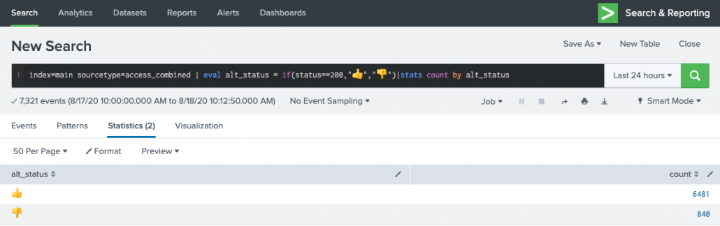
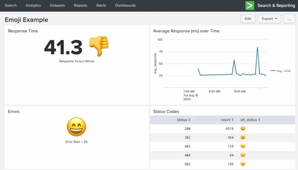
Errors single-value panel: index=main sourcetype=access_combined | stats count(eval(status >= 500)) as errors count as total | eval error_rate=round((errors/total)*100,1) | eval alt_status = if(error_rate >= 3, "😕","😄")| fields alt_status
Status Codes table panel: index=main sourcetype=access_combined | stats count by status | eval alt_status = case(status >= 500, "😠",status >=400, "😕", status >= 200, "😄", 1==1,"❓")
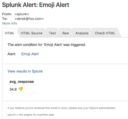
Or even using them in alerts (results will vary depending if the target of the alert can handle Unicode). Here’s an email example with the results embedded inline:
Maybe you can live on the wild side and even ask your developers to start using emoji’s in their logs….
Ok, that’s fun and all, but is there a practical use for emoji’s in Splunk? Sure! Why not give your dashboards some more visual eye candy when it comes to location data. You can easily create a lookup that maps Country name to their emoji flag.
Top Country single-value panel: index=main sourcetype="access_combined" | top limit=1 clientip | iplocation clientip | eval Country = if(Country=="", "Unknown", Country) | lookup emoji_flags name as Country OUTPUT emoji | fillnull value="❓" emoji | eval top_country= Country." ".emoji | fields top_country
Requests By Country table panel: index=main sourcetype="access_combined" | stats count by clientip | iplocation clientip | eval Country = if(Country=="", "Unknown", Country) | stats sum(count) as total by Country | lookup emoji_flags name as Country OUTPUT emoji | fillnull value="❓" emoji | sort - total
You can download the flag to emoji lookup CSV here to use in your own searches.
The possibilities are endless! So have some fun with emojis in your dashboards, lets just hope that at no point do your dashboards or data go to 💩 …
There are multiple (almost discretely infinite) methods of outlier detection. In this blog I will highlight a few common and simple methods that do not require Splunk MLTK (Machine Learning Toolkit) and discuss visuals (that require the MLTK) that will complement presentation of outliers in any scenario. This blog will cover the widely accepted method of using averages and standard deviation for outlier detection. The visual aspect of detecting outliers using averages and standard deviation as a basis will be elevated by comparing the timeline visual against the custom Outliers Chart and a custom Splunk’s Punchcard Visual.
Some Key Concepts
Understanding some key concepts are essentials to any Outlier Detection framework. Before we jump into Splunk SPL (Search Processing Language) there are basic ‘Need-to-know’ Math terminologies and definitions we need to highlight:
Outlier Detection Definition: Outlier detection is a method of finding events or data that are different from the norm.
Average: Central value in set of data.
Standard Deviation: Measure of spread of data. The higher the Standard Deviation the larger the difference between data points. We will use the concept of standard substantially in today’s blog. To view the manual method of standard deviation calculation click here.
Time Series: Data ingested in regular intervals of time. Data ingested in Splunk with a timestamp and by using the correct ‘props.conf’ can be considered “Time Series” data
Additionally, we will leverage aggregate and statistic Splunk commands in this blog. The 4 important commands to remember are:
Bin: The ‘bin’ command puts numeric values (including time) into buckets. Subsequently the ‘timechart’ and ‘chart’ function use the bin command under the hood
Eventstats: Generates statistics (such as avg,max etc) and adds them in a new field. It is great for generating statistics on ‘ALL’ events
Streamstats: Similar to ‘stats’ , streamstats calculates statistics at the time the event is seen (as the name implies). This feature is undoubtedly useful to calculate ‘Moving Average’ in additional to ordering events
Stats: Calculates Aggregate Statistics such as count, distinct count, sum, avg over all the data points in a particular field(s)
Data Requirements
The data used in this blog is Splunk’s open sourced “Bots 2.0” dataset from 2017. To gain access to this data please click here. Downloading this data set is not important, any sample time series data that we would like to measure for outliers is valid for the purposes of this blog. For instance, we could measure outliers in megabytes going out of a network OR # of logins in a applications using the using the same type of Splunk query. The logic used to the determine outliers is highly reusable.
Using SPL
There are four methods commonly seen methods applied in the industry for basic outlier detection. They are in the sections below:
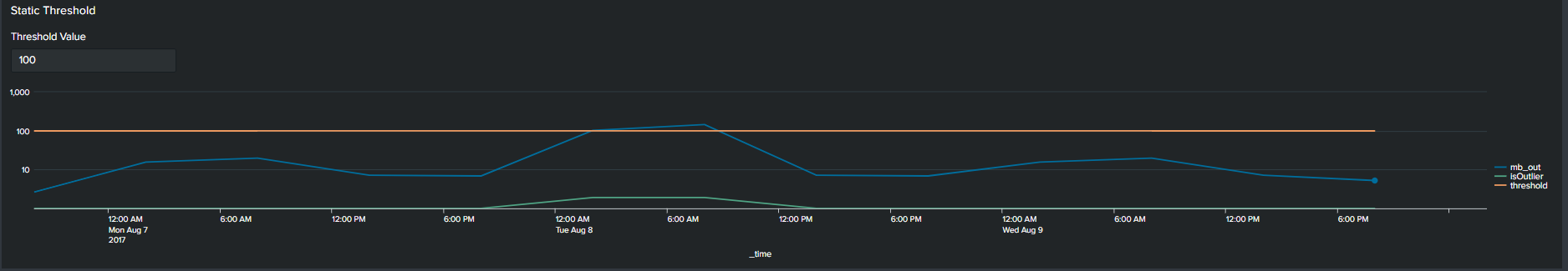
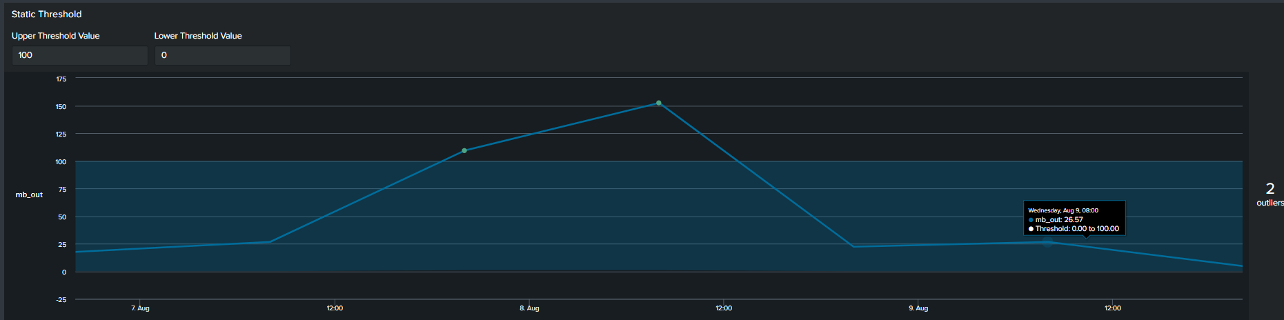
1. Using Static Values
The first commonly used method of determining an outlier is by constructing a flat threshold line. This is achieved by creating a static value and then using logic to determine if the value is above or below the threshold. The Splunk query to create this threshold is below :
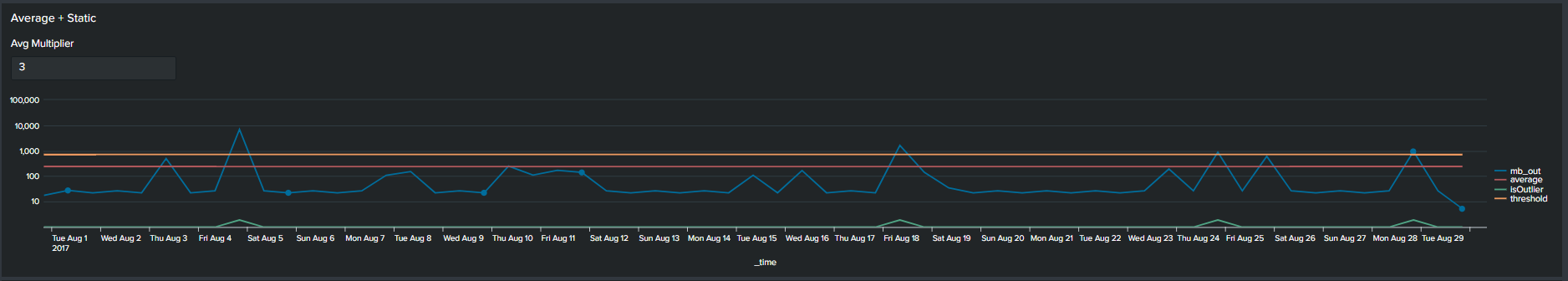
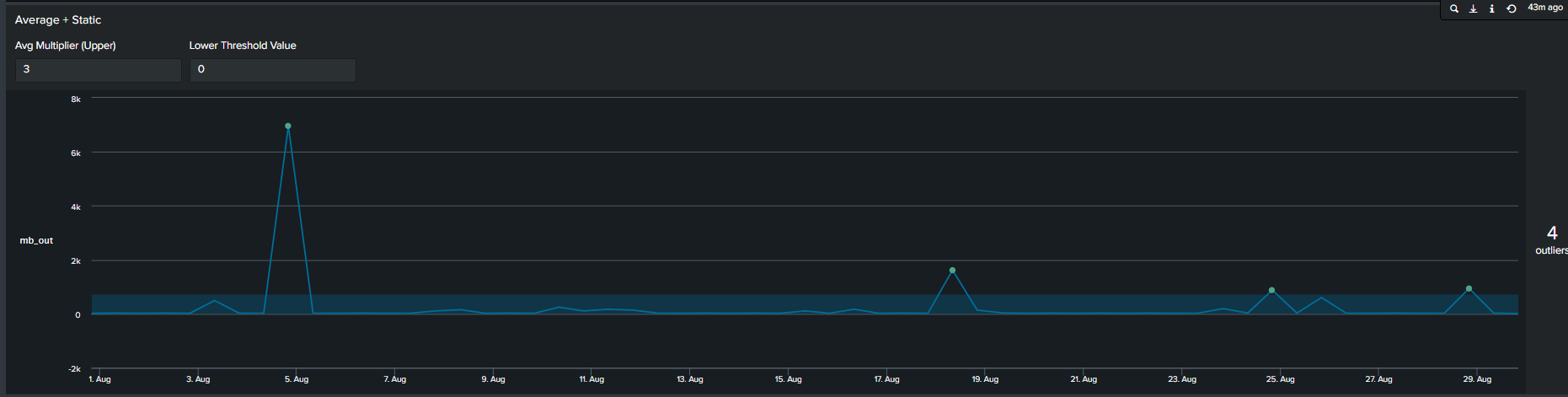
In addition to using arbitrary static value another method commonly used method of determining outliers, is a multiplier of the average. We calculate this by first calculating the average of your data, following by selecting a multiplier. This creates an upper boundary for your data. The Splunk query to create this threshold is below:
<your spl base search> …
| timechart span=12h sum(mb_out) as mb_out
| eventstats avg("mb_out") as average
| eval threshold=average*2
| eval isOutlier=if('mb_out' > threshold, 1, 0)
Average + Static threshold timeline visual
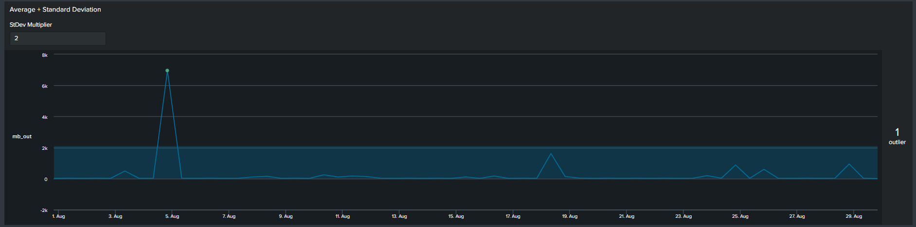
3. Average with Standard Deviation
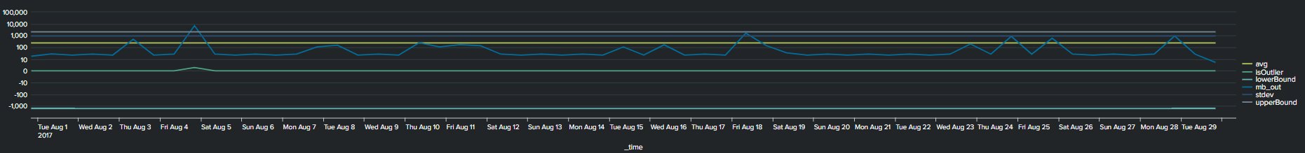
Similar to the previous methods, now we use a multiplier of standard deviation to calculate outliers. This will result in a fixed upper and lower boundary for the duration of the timespan selected. The Splunk query to create this threshold is below:
<your spl base search> ... | timechart span=12h sum(mb_out) as mb_out
 | eventstats avg("mb_out") as avg stdev("mb_out") as stdev
 | eval lowerBound=(avg-stdev*exact(2)), upperBound=(avg+stdev*exact(2))
 | eval isOutlier=if('mb_out' < lowerBound OR 'mb_out' > upperBound, 1, 0)
2*Standard Deviation timeline visual
Notice that with the addition of the lower and upper boundary lines the timeline chart becomes cluttered.
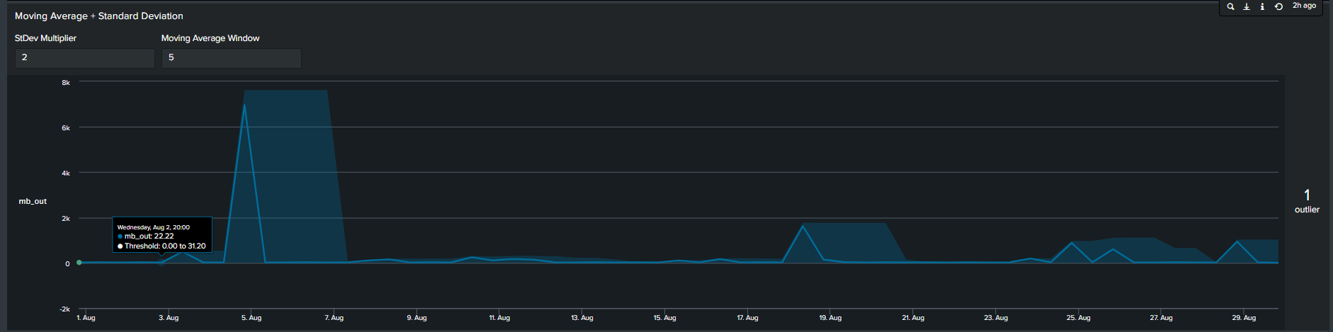
4. Moving Averages with Standard Deviation
In contrast to the previous methods, the 4th most common method seen is by calculating moving average. In short, we calculate the average of data points in groups and move in increments to calculate an average for the next group. Therefore, the resulting boundaries will be dynamic. The Splunk search to calculate this is below:
<your spl base search> ... | timechart span=12h sum(mb_out) as mb_out
 | streamstats window=5 current=true avg("mb_out") as avg stdev("mb_out") as stdev
 | eval lowerBound=(avg-stdevexact(2)), upperBound=(avg+stdevexact(2))
 | eval isOutlier=if('mb_out' < lowerBound OR 'mb_out' > upperBound, 1, 0)
Moving Average with Standard Deviation timeline chart
Tips: Notice the “isOutliers” line in the timeline chart, in order to make smaller values more visible format the visual by changing the scale from linear to log format.
Using the MLTK Outlier Visualization
Splunk’s Machine Learning Toolkit (MLTK) contains many custom visualization that we can use to represent data in a meaningful way. Information on all MLTK visuals detailed in Splunk Docs. We will look specifically at the ‘Outliers Chart’. At the minimum the outlier chart requires 3 additional fields on top of your ‘_time’ & ‘field_value’. First, would need to create a binary field ‘isOutlier’ which carries the value of 1 or 0, indicating if the data point is an outlier or not. The second and third field are ‘lowerBound’ & ‘upperBound’ indicating the upper and lower thresholds of your data. Because the outliers chart trims down your data by displaying only the value of data point and your thresholds, we can conclude through use that it is clearer and easier to understand manner. As a recommendation it should be incorporated in your outliers detection analytics and visuals when available.
Continuing from the previous paragraph, take a look at the below snippets at how the impact the outliers chart is in comparison to the timeline chart. We re-created the same SPL but instead of applying timeline visual applied the ‘Outliers Chart’ in the same order:
Static threshold w outliers chartAverage + Static threshold timeline visual 2*Standard Deviation outliers chart Moving Average with Standard Deviation outliers chart
Advantages
Disadvantages
Cleaner presentation and less clutter
You need to install Splunk MLTK (and its pre-requisites) to take advantage of the outliers chart
Easier to understand as determining the boundaries becomes intuitive vs figuring out which line is the upper or lower threshold
Unable to append additional fields in the Outliers chart
Adding Depth to your Outlier Detection
Determining the best technique of outlier detection can become a cumbersome task. Hence, having the right tools and knowledge will free up time for a Splunk Engineer to focus on other activities. Creating static thresholds over time for the past 24hrs, 7 days, 30 days may not be the best approach to finding outliers. A different way to measure outliers could be by looking at the trend on every Monday for the past month or 12 noon everyday for the past 30 days. We accomplish this by using two simple and useful eval functions:
Continuing from the previous section, we incorporate the two highlighted eval functions in our SPL to calculate the average ‘mb_out’. However, this time the average is based on the day of the week and the hour of the day. There are a handful of advantages of this method:
Extra depth of analysis by adding 2 additional fields you can split the data by
Intuitive method of understanding trends
Some use cases of using the eval functions are as follows:
Network activity analysis
User behaviour analysis
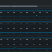
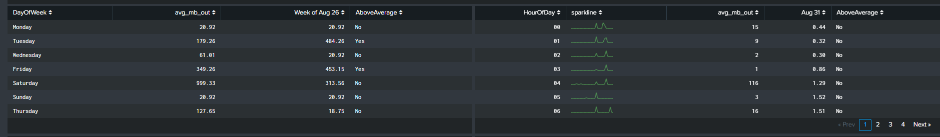
Tables representing averages by DayOfWeek & HourOfDay
Visualizing the Data!
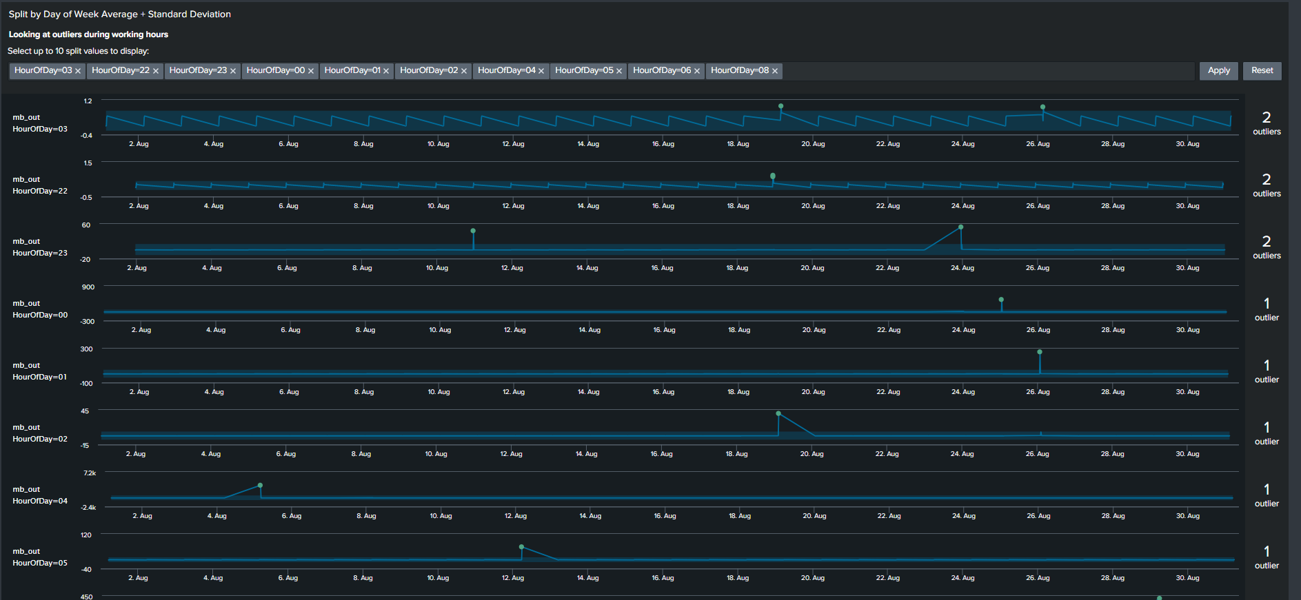
We will focus on two visualizations to complement our analysis when utilizing the eval functions. The first visual, discussed before, is the ‘Outliers Chart’ which is a custom visualization in Splunk MLTK. The second visual is another custom visualization ‘PunchCard’, it can be downloaded from Splunkbase here (https://splunkbase.splunk.com/app/3129/).
The outliers chart has a feature which results in a ‘swim lane’ view of a selected field/dimension and your data points while highlighting points that are outliers. To take advantage of this feature, we will use a Macro “splitby” which creates a hidden field(s) “_<Field(s) you want data to split by>”. The rest of the SPL is shown below
This search results in an Outlier Chart that looks like this:
Outliers Chart split by hour of day
The Outliers Chart has the capability to split by multiple fields, however in our example splitting it by a single dimension “HourOfDay” is sufficient to show its usefulness.
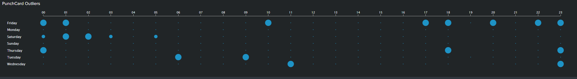
The PunchCard visual is the second feature we will use to visualize outliers. It displays cyclical trends in our data by representing aggregated values of your data points over two dimensions or fields. In our example, I’ve calculated the sum of outliers over a month based on “DayOfWeek” as my first dimension and “HourOfDay” as my second dimension. I’ve adding the outliers of these two fields and displaying it using the PunchCart visual. The SPL and image for this visual is show below:
< your base SPL search > ... | streamstats window=10 current=true avg("mb_out") as avg stdev("mb_out") as stdev by "DayOfWeek" "HourOfDay"
| eval avg=round(avg,2)
| eval stdev=round(stdev,4)
| eval lowerBound=(avg-stdevexact(2)), upperBound=(avg+stdevexact(2))
| eval isOutlier=if('mb_out' < lowerBound OR 'mb_out' > upperBound, 1, 0)
| splitby("DayOfWeek","HourOfDay")
| stats sum(isOutlier) as mb_out by DayOfWeek HourOfDay
| table HourOfDay DayOfWeek mb_out
PunchCard Visual
Summary and Wrap Up
Trying to find outliers using Machine Learning techniques can be a daunting task. However I hope that this blog gives an introduction on how you can accomplish that without using advanced algorithms. Consequently, using basic SPL and built-in statistic functions can result in visuals and analysis that is easier for stakeholders to understand and for the analyst to explain. So summarizing what we have learnt so far:
One solution does not fit all. There are multiple methods of visualizing your analysis and exploring your result through different visual features should be encouraged
Use Eval functions to calculate “DayOfWeek” and “HourOfDay” wherever and whenever possible. Adding these two functions provides a simple yet powerful tool for the analyst to explore the data with additional depth
Trim or minimize the noise in your Outliers visual by using the Outliers Chart. The chart is beneficial in displaying only your boundaries and outliers in your data while shaving all other unnecessary lines
Use “log” scale over “linear” scale when displaying data with extremely large ranges
Anyone who is familiar with writing search queries in Splunk would admit that eval is one of the most regularly used commands in their SPL toolkit. It’s up there in the league of stats, timechart, and table.
For the uninitiated, eval, just like in any other programming context, evaluates an expression and returns the result. In Splunk, especially when searching, holds the same meaning as well. It is arguably the Swiss Army knife among SPL commands as it lets you use an array of operations like mathematical, statistical, conditional, cryptographic, and text formatting operations to name a few.
Read more about eval here and eval functions here.
What is an Ingest-time Eval?
Until Splunk v7.1, the eval command was only limited to search time operations. Since the release of 7.2, eval has also been made available at index time. What this means is that all the eval functions can now be used to create fields when the data is being indexed – otherwise known as indexed fields. Indexed fields have always been around in Splunk but didn’t have the breadth of capabilities for populating them until now.
Ingest-time eval doesn’t overlap with other common index-time configurations such as data filtering and routing, but only complements it. It lets you enrich the event with fields that can be derived by applying the eval functions on existing data/fields in the event.
One key thing to note is that it doesn’t let you apply any transformation to the raw event data, like masking.
When to use Ingest-time eval
Ingest-time eval can be used in many different ways, such as:
Adding data enrichment such as a data center field based on a host naming convention
Normalizing fields such adding a field with a FQDN when the data only contains a hostname
Using additional fields used for filtering data before indexing
Performing common calculations such as adding a GB field when there is only a MB field or the length of a field with a string
Ingest-time eval can also be used with metrics. Read more here.
When not to use Ingest-time eval
Ingest-time eval, like index-time field extractions, adds a performance overhead on the indexers or heavy forwarders (whichever is handling the parsing of data based on your architecture) as they will be evaluated on all events of the specific sourcetypes you define it for. Since the new fields are going to be permanently added to the data as they are indexed, the increase in disk space utilization needs to be accounted for as well. Also there is no reverting these new fields as these are indexed/persisted in the index. To remove the data, the ingest-time eval configurations would need to be disabled/deleted and letting the affected data age out.
When using Ingest-time eval also consider the following:
Validate if the requirement is something that can be met by having an eval function at search time – usually this should be yes!
Always use a new field name that’s not part of the event data. There should be no conflict with the field name that Splunk automatically extracts with the `KV_MODE=auto` extraction.
Always ensure you are applying eval on _raw data unless you have some index time field extraction that’s configured ahead of it in the transforms.conf.
Always ensure that your indexers or heavy forwarders have adequately hardware provisioned to handle the extra load. If they are already performing at full throttle, adding an extra step of processing might be that final straw. Evaluate and upgrade your indexing tier specs first if needed.
Now, lets see it in action!
Here is an Example…
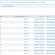
Lets assume for a brief moment you are working in Hollywood, with the tiny exception that you don’t get to have coffee with the stars but just work with their “PCI data”. Here’s a sample of the data we are working with. It’s a sample of purchase details that some of my favorite stars made overseas (Disclaimer: The PCI data is fake in case you get any ideas 😉):
Now we are going to create some ingest-time fields:
Making the name to all upper case (just for the sake of it)
Rounding off the amount to two decimal places
Applying a bank field based on the starting four digit of the card number
Applying md5 hashing on the card number
Applying a mask to the card number
First things first, lets set up our props.conf for the data with all the recommended attributes defined. What really matters in our case here is the TRANSFORMS attribute.
[finlog] SHOULD_LINEMERGE=false LINE_BREAKER=([\r\n]+) TRUNCATE=10000 TIME_FORMAT=%Y-%m-%d %H:%M:%S,%f MAX_TIMESTAMP_LOOKAHEAD=25 TIME_PREFIX=^ TRANSFORMS = fineval1, fldext1, fineval2 # order of values for transforms matter
Now let’s define how the transforms.conf should look like. This essentially is the place where we define all our eval expressions. Each expression is comma separated.
[fineval1] INGEST_EVAL= uname=upper(replace(_raw, ".+name=([\w\s'-]+),\stime.*","\1")), purchase_amount=round(tonumber(replace(_raw, ".+amount=([\d\.]+),\scurrency.*","\1")),2) # notice how in each case we have to operate on _raw as name and amount fields are not index-time extracted.
[fldext1] REGEX = .+cc=(\d{15,16}) FORMAT = cc::"$1" WRITE_META = true
[fineval2] # INGEST_EVAL= cc=md5(replace(_raw, ".+cc=(\d{15,16})","\1")) # have commented above as we need not apply the eval to the _raw data. fldext1 here does index time field extraction so we can apply directly on the extracted field as below... INGEST_EVAL= cc1=md5(cc), bank=case(substr(cc,0,4)=="9999","BNC",substr(cc,0,4)=="8888","XBS",1=1,"Others"), cc2=replace(cc, "(\d{4})\d{11,12}","\1xxxxxxxxxxxx")
All the above settings should be deployed to the indexer tier or heavy forwarders if that’s where the data is originating from.
A couple things to note – you can define your ingest-time eval in separate stanzas if you choose to define them separately in the props.conf. Below is a use case for that. Here I have defined an index time field extraction to extract the value of card number. Then in a separate stanza, I used another ingest-time eval stanza to process on that extracted field. This is a good use case of reusability of regex (instead of applying it on _raw repeatedly) in case you need to do more than one operations on specific set of fields.
Now we need to do a little extra work that’s not common with a search time transforms setting. We have to add all the new fields created above to fields.conf with the attribute INDEXED=true denoting these are index time fields. This should be done in the Search Head tier.
[cc1] INDEXED=true
[cc2] INDEXED=true
[uname] INDEXED=true
[purchase_amount] INDEXED=true
[bank] INDEXED=true
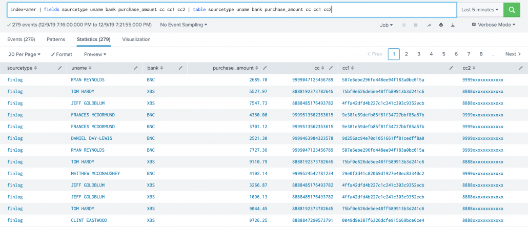
The result looks like this:
One important note about implementing Ingest-time eval configurations, is that they require manual edits to .conf files as there is no Splunk web option for it. If you are a Splunk Cloud customer, you will need to work with Splunk support to deploy them to the correct locations depending on your architecture.
OK so that’s a quick overview of Ingest-time eval. Hope you now have a pretty fair understanding of how to use them.